Can You Spot the Smart Strategy in this Advertorial?
If you ever wanted a great example of how to design a full page advertorial-style advertisement, the example I am showing in this article should be at the top of your list. For those not familiar with advertorials, they are an “old school” strategy to make an advertisement not look like an advertisement and more like an article.
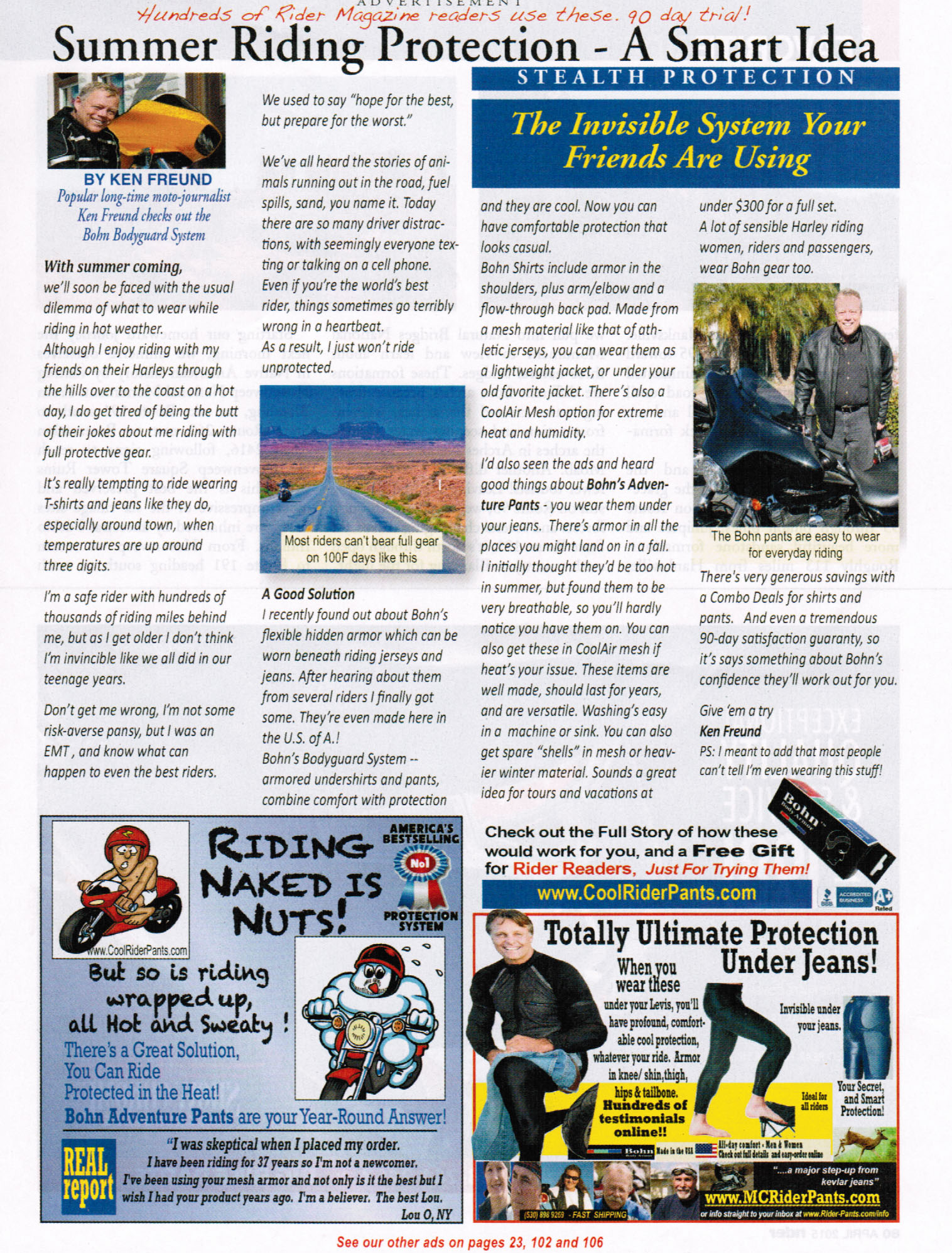
While I am not a customer, with a little bit of research I realized this company is a big-time advertiser with several different ads and advertorials in a single issue of Rider Magazine. Reviewing several months’ issues resulted in many ads throughout the year. This tells me their ads are probably working quite well for them and worthy of your study.
This particular advertorial does a BUNCH OF SMART THINGS that can be used by anybody reading this in their own advertising and marketing, but there is one unique thing that really caught my eye and something I have not seen in quite a while.
Do you know what it is?
Click on the above image to enlarge the ad so you can read it easier and then leave a comment or two below listing the smart marketing strategies you see in this ad (as I said there are a lot of them).
Later this week, I will compile all the responses from readers and update this article and see if anybody identifies the unique strategy this advertorial exhibits. The first person who correctly identifies it will win a book of their choice (I will follow-up by email).
To play along, simply type in your answer(s) below and check back this Friday. Good luck!
UPDATE
It’s very satisfying to see that so many smart marketers read my articles and like to play along. It didn’t take more than a few minutes for the first person to correctly identify the smart strategy of dividing this full page ad into something that looks like multiple ads. The two bottom “sub-ads” is a smart strategy to accomplish several things, including:
- Making this this look more like an article.
- Grabbing readers’ eyeballs with a different look and feel. One sub-ad might catch a certain reader’s eye and the other may appeal to somebody different.
- Testing different calls-to-action.
Overall this advertorial is a powerful example of how design can play a HUGE impact on effectiveness. Talk about the smart use of real estate on this page!
Congrats to James Daniel for being the first person to respond with this answer (Jim Hart, you were a close second!).
Here’s a list of reader-contributed insights, all of which are good reminders:
- Use of mini-ads within the overall ad, all from the same company.
- CopyDoodle-like, hand-written message above the headline helps make it look different and grabs eyeballs.
- Ad is personalized to this specific magazine’s readers – implied social proof.
- Making the claim that “hundreds of Rider Magazine readers” are already customers.
- Use of a free offer.
- Use of celebrity author/testimonial
- Use of customer testimonial.
- Use of 90 day trial offer.
- 4 different means to communicate/engage (phone + 3 websites).
- Implied intelligence (smart idea, riding naked is nuts).
- Letting readers know about their other ads at the bottom.
- Driving online to get “the full story.”
- Use of author photo and byline.
- Writing to a friend type letter feel.
The thing that really caught my eye (and something I don’t recall seeing in an advertorial) is the script just above the headline “Hundreds of Rider Magazine readers use These…90 day trial.” It’s like a Copydoodle and a “risk free” offer, all rolled into one, and at the very beginning.
Hi Mike
I like the way they use 2 panels at the end – they look like separate ads, but actually tell part of the story. It gives them a number of different chances to catch the reader’s eye and draw them into the copy. The contrasting styles of the ‘ads’ is notable, because at first glance it seems they’re independent of the copy.
Not sure if that’s the device you’re looking for, but I think it’s a good way to increase readership…
Cheers
James
I like that they include 2 of their display ads at the bottom of the advertorial. Gives them another chance to catch the skimmers who may not get pulled in to the ‘article.’
Hi,
I think the unique strategy you are referring to is stating “Hundreds of Rider Magazine readers use these,” and then offering a free gift /90 day trial to Riders Readers only. Saying “your friends are using these” is also part of this strategy.
Hope I’m correct 🙂
Thanks!
Melissa
Hi Mike, what I noticed is that there is two advertisements as the bottom where one advertisement is promoting protection under jeans and while the other is promoting riding free from being hot and sweaty that includes a free report. One ad is an cartoon and the other isn’t. ..
And of course the fun advertisement is more intriguing.
Love, Darnell
One more thing, the bottom left advertisement is promoting the opposite of the whole and all advertisements on the page included with a free report
The text at the top looks like someone wrote it in to draw the reader’s attention.
So I’ll echo the obvious: copy-doodle-like notation at the top of the ad, and the related display ads at the bottom. Additionally, I noted the use of the following smart marketing strategies:
Free Offer
Celebrity Author/Testimonial
Customer Testimonial
90 Day Trial Offer
Implied Social Proof
4 different means to communicate/engage (phone + 3 websites)
Implied intelligence (smart idea, riding naked is nuts)
Very interesting, Mike. The 2 ads down at the bottom of the page make the advertorial seem even MORE like a real informative article BUT referring people to their 3 OTHER ads in the same publication (I believe) is the doozie you’re emphasizing here.
I like the fact that they combined the article with the 2 ads.
Also they are using 2 different web pages. One for the free gift and the other in the ad.
I like the offer of the free gift and the strategy of driving them to the website for “the full story”. Essentially driving the prospect from offline to online to further tell their story and ultimately make the sale.
Hi Mike, great example.
I’d have to say the key element to give the ad the appearance of an article was using a by-line and a photo of the writer. It mimics how an actual article might appear in the publication.
Of course Ken’s story, told in first person, continues to give the feel of an article and pulls the reader (or should I say… rider) in.
Then using columns, photos, and a type face similar to the editorial portion of the publication completes the magic.
Hi Mike,
I noticed Ken adds a P.S. at the end of the advertorial, which you usually only see in sales letters. A nice touch!