Take This Simple Direct Mail Test & Avoid Costly Mistakes
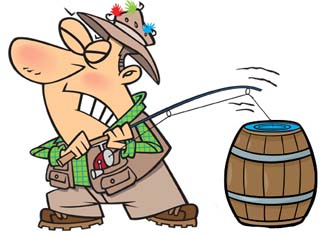
I will make a professional disclaimer right from the start – critiquing 99% of the direct mail that lands on my desk is like fishing out of a barrel – there’s really no challenge to it, because most of the direct mail being sent is so bad.
So the purpose of this article is not to illustrate my direct mail prowess, but instead offer you a simple, one-question direct mail test (and reminder of what NOT to do).
Ready for this simple direct mail test…?
Question: Does your direct mail look like this?
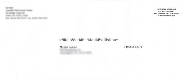
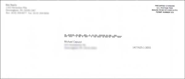
Answer: I sure hope not!!!
If your lead generation direct mail looks like the two samples above, please do yourself a big favor and STOP!
You will save yourself time, money and frustration.
And you will save the poor souls who have to now throw it, unopened, into their recycling bin.
Friend, if you read my blog articles and/or are a High Impact Marketing Club member, I’m guessing there’s a good chance you would never send out direct mail like this – ever. These two examples of Big Dumb Marketing (BDM) perfectly illustrate what’s so wrong with much of the marketing business owners attempt on a daily basis.
For background sake, these are mailings from local insurance agents asking me to call them to learn how to save money on my auto and home insurance (ironically I received them two days apart). I would love to know what the results of these mailings are, but since I highly doubt the local agents or the parent company track response, I will never know. But my guess is the results are pretty bad.
If you’re new to my personal brand of High Impact Marketing, let me share the top five reasons to NEVER, EVER send marketing out that looks like this.
Reason #1 – It looks and feels like “junk mail.” How ironic that two different mailings from two different agents LOOKS EXACTLY the same. There is NOTHING to differentiate or make this feel like its personal mail. Save for the return address they are the same, PLAIN VANILLA look and feel.
High Impact Direct Mail Tip #1 – Make your mail look as hand-crafted as possible. Use colored envelopes, textured paper, handwriting, different fonts, etc. to make your mail stand out and get opened!
Reason #2 – The lack of a real stamp further proves a machine, not a person, sent this to me.
High Impact Direct Mail Tip #2 – whenever you can, use real, live stamps on your mailings.
Reason #3 – The senders wasted a lot of valuable real-estate. The only purpose of the envelope, besides ensuring your mail gets to its destination safely, is to get the recipient to notice it and open it. You have to work hard at this and not waste valuable space to get attention and get it opened.
High Impact Direct Mail Tip #3 – Use the valuable real estate of your envelopes wisely. Consider adding “teaser copy” on the front or back. Add CopyDoodles® to make it stand out. The bottom line is you want it to stand out and look personally unique!
Reason #4 – There is absolutely NO REASON for me to open this letter. Even though it’s already failed the junk mail look and feel test, they could have at least put some compelling teaser copy on the envelope to give me some reason to open. Nada, zilch, nothing.
High Impact Direct Mail Tip #4 – Teaser copy is copy that you put on an envelope to get somebody to notice it and take action. While you may not use it all the time, the greatest, most successful direct mail packages in history typically took advantage of teaser copy.
Reason #5 – It’s cold and sterile. As I am writing this article, the ground is covered with snow and its 10 degrees Fahrenheit out. These envelopes and the letters inside are no different and they makes me feel the same way.
High Impact Direct Mail Tip #5 – What you put your direct mail in as just as important as what’s on the inside. High Impact Marketers take great care and consideration when it comes to crafting and designing their direct mail. There have been entire books written just about envelopes, it’s that important.
If you’re a student of direct mail, I would love to hear your thoughts about what makes for good (and not so good) direct mail. Leave a comment below!
Mike, Have you done any tests to track which colors of copydoodles or even which copydoodles would increase response?
i.e. “Invitation Enclosed”… “Do not Bend”…. copy stamps vs. same in just handwritten font, etc.
Tim, on white envelopes, I like using red doodle or stamp. On colored envelopes, depending on the color, I tend to just use black doodles and stamps. For mailings that have a hard deadline, often I will use a stamp on the outside with the deadline date. If it’s a first step mailing, I will use a doodle like “Important information from Mike Inside” or something that conveys the importance of the contents and that I am sending it to them.
I rarely use white envelopes anymore unless it’s to someone I know.
I like using 3D mail like bank bags and mini trash cans. I also use fake rush priority express envelopes to mail packages.