Disney Does Doodles!
Got a neat little multi-panel self-mailer in the mail the other day from Disney, but what really caught my eye was their use of doodles and handwriting in the piece.
A few of them looked so similar to CopyDoodles®, I actually checked to see if they some of our hand-drawn doodles (they weren’t, but it’s still neat to see a company like Disney using doodles in their marketing. You can click on the images to get a larger view of the piece.
This 6 panel self-mail does a lot of things right, yet there is one fundamental flaw – do you know what it is?
Before you look for it, let me show you what I think they’re doing right.
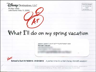
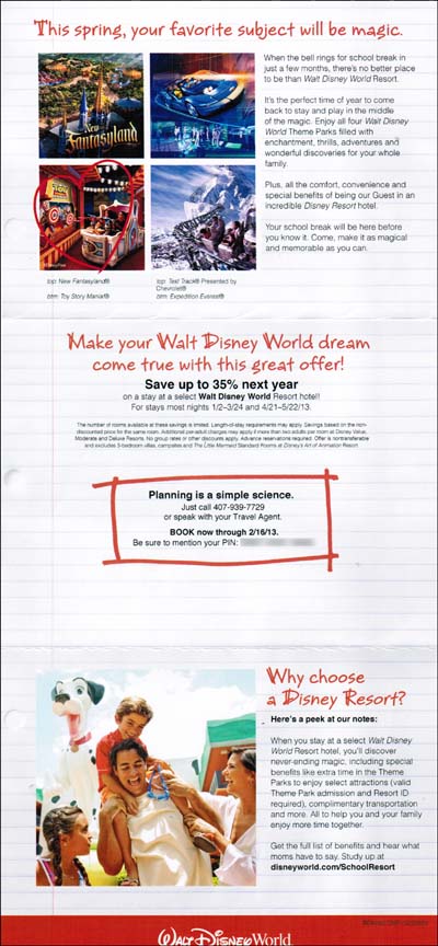
Maximizing real-estate. The mailing dimensions of this piece are 8.25” x 6”, which is the size of an oversized postcard. Yet by using a tri-fold design, Disney has six panels to work with, giving them plenty of space to get me to take action. I am showing you the inside three panels and one outside panel,
Good eye flow. Many marketers do not take this into consideration, but Disney did. As soon as you open it up, your eyes are attracted to the middle panel with the rectangular doodle, which showcases their offer. Then you automatically scan from top to bottom.
Handwriting adds a personal, me to you touch. Adding handwriting and CopyDoodles is a super-smart way to add eye magnets to get people to notice your marketing.
Excellent use of graphics and photos. The two panels I omitted had some quality photos and as you can see there are several other eye-catching graphics throughout the piece. I could see the addition of a few more text doodles, such as SAVE NOW that could enhance this further. The Mickey ears doodle is classic.

Nice tie-in to an event. Disney is leveraging spring break as a reason why you should take a vacation. By tapping into this event (and the emotion is stirs), Disney is doing it right and though it’s not the fundamental flaw, the copy could be a stronger.
Clear, simple call to action. I can either pick up the phone or visit their web site. Directions are clear and simple to follow.
Overall a nice piece, yet they are making a fundamental flaw that is affecting response and is easily fixed. Do you know what it is?
Win a CopyDoodles Luggage Tag Identifier!

We have our brand new CopyDoodles luggage tag identifier. Everybody loves these and I am going to give the first three readers who spot the fundamental flaw a CopyDoodles luggage tag identifier.
To submit your idea for the fundamental flaw, simply leave a comment below. To be eligible you need to tell me what the flaw is AND what you would do to fix it.
Later this week, I will post the answer and the winners. Good luck and I look forward to seeing who can find the fundamental flaw!


Spring vacation?… In January?
Nadine – you have to give them credit for being ahead of the ball here.
I think they’re missing a sense of urgency. Granted, this mailer is on the front end of a campaign and you’ll likely get 2-3 additional “reminders” before their “deadline” of 2/15/13.
So – 2/15 is pretty far away and I have no incentive to rush out and purchase this. I’ll wait for the next mailer…
Additionally, and this might be unfounded because they may have a strategy here – and as a marketer, I think the subtle play for mid January sales is too subtle. Again – no sense of urgency.
What would I do?
Offer an early bird reservation value – either a discount on existing packages or added value for the regular price… with an early bird deadline.
I might also offer a QR code to a video with people “just like you” having a blast at Disney World with an opt-in for special offers during your January visit.
No personalization on the inside…
I think this is it: they did not give multiple ways of response to book your vacation. They only say call this number or see your travel agent. Being Disney they should also say go on line, fax us here, call this special number just for this vacation, write Mickey Mouse a letter here, click on this app, scan this URL code and on and on. The options are endless. I love the GKIC newsletters, and of course yours too Mike! They are loaded with tips and one thing I learned from Dan is that the more ways you have to respond to an offer, the more likely they will place an order. By the way Mike, thanks to your last contest my catalog, first mailing going out today, went from four pages to eight in part thanks to your last contest. I did not have an order form in the catalog and once I added one, the back side was blank so I added another awesome high price product to boost even more response. I think it will do really well. I’ll let you know how it goes.
No urgency. Good marketing includes a reason to act today. And, since the theme was all about planning, the missing deadline is an even bigger faux pas.
No call to action to do anything!
Mike,
There are a # of flaws that I see.
1. I would never use pre sorted bulk mail logo. A stamp would have been really nice and would have added to the piece on a more personal level.
2. I would never use a label. If I did, I’d have used my DocFont, lol.
3. I learned from a smart marketer once that too many different fonts, included larger fonts, and italicized fonts (more than 3 different ones in a panel) will confuse the mind, but these are things that most marketers never look at when they’re writing the piece. Most likely Disney doesn’t know this, but you do.
Have a great day Mike,
Dr. Carney
P.O. Box 1817
Temecula, CA 92593
(951) 760-0798
Schools out 1/18-1/21!
1. Not every school is out those dates
2. Those are not spring break dates, those are after Christmas dates. The whole brochure is about spring break!
3. Some people might assume the special rates only apply those dates (4 days)
Gil, all good points! Love the QR code idea too!
Maria – good point! Given the feel of the piece, I am surprised they did not do more personalization. Personalized URL, my name, last time I visited, etc. But not the fundamental flaw!
They could have used a live stamp instead of a indicia
Edwin – great job on making progress! They two have two ways to respond (which is better than one), so that’s not the fundamental flaw.
Good advice Doc!
At first glance, the stick on label and no live stamp seems to negate the CopyDoodle and handwriting personalization. Perhaps cost was a factor due to the volume of the mailing, but if they were going after personalization, using the same handwriting font for the address and substituting the recipient’s name for “I’ll” in the headline (or even using ‘you’ instead) may have boosted ROI.
Mike:
They forgot the P. S.!
A strong P. S. that resume again but short the OFFER and tell us again the CALL TO ACTION.
The P. S. is or should be strong.
When we write our letters we MUST have a checklist, I think they forgot this important list.
Did you watch the Felix freefall last Sunday?
They had a Protocol, a Checklist of 30+ things TO-DO before leave the capsule.
*A tip for the Disney writer from me is that he needs to add also some “bullets” in their BENEFITS (you tell me Mike)
P. S. If you want to watch the Felix free fall replay GO NOW to YouTube and search “RedBull Stratosfere”.
P. P. S. Don’t forget to use a CHECKLIST.
There’s no “continue the conversation” vehicle. Something that gets plastered on the fridge until the call to Disney is made (coupon with PIN#). When you give someone something, they have an inherent desire to reciprocate and balance the “gift giving”. Maybe a card they can take to the souviener shop for a free take-away. Maybe a BCR for a free planning kit. Something to continue the conversation.
I love copydoodles but instead of the one on the outside it should have a real Mickey Mouse face… either the cartoon version or a photo of the mickey from the parks… WHY? Because he is one of the most recognizable figures on the planet… and the doodle with the A+ doesn’t make any sense at first glance… And thus they are not using their top most marketing ASSET… the Disney characters.
Following on that thought the inside should show at least a few disney characters but it actually shows none (except for the dalmation in the family photo which is not one of their icon characters like Mickey, Goofy, Donald Duck etc.)
I personally love Goofy so would advocate he be in there somewhere tied to a message about the fun.
They’ve failed to make the offer concrete. Thirty-five percent in the travel industry is a vague target.
If they wrote something like “rates as low as $186.72 per night” or “enjoy a 5-day vacation for as little as $873” it would help.
Similarly, I think they missed the boat by failing to offer a free gift or premium for responding by a date.
PS. Hey Mike! It’s a luggage handle personalizer, or luggage beacon — not a tag identifier … But I’d still like one from you! 😉
The dates on the front are not spring and presumptuous to think that everyone has those as vacation time. I’d either give the spring dates there or call them the “early” spring with some sort of bonus when you look inside…
Hi Mike,
I don’t see a reason to respond “right now”. The deadline is so far out in advance that people will surely place the postcard in their mail pile to take care of later and then later never happens.
-Sarah
Hi Mike,
I believe the fundamental flaw is not using testimonials. Real words from real people carry more weight than a slick marketing copy. Therefore, I would include testimonials from clients who have already gone to Disney with their children during school break.
Hey great find, Mike – nice to see how Disney’s using copy cosmetics/doodles, I’m, a huge fan of Disney’s positioning and branding approach.
flaw:
#1 is multiple CTAs/calls to action. they have a URL, a phone number to call, there’s not a single readership path/single cta would be my focal point.
#2) missing avatar: obviously I would’ve doodled the entire figure of Mickey, not just head/ears, as a draw, to magnetize and personalize the approach.
#3) Also agree 110% w/earlier comments re lack of deadline/urgency. There should’ve been a date no further than 2 weeks away, for special report/etc. at optin site.
those are the 3 things I’d fix, personally.
btw copydoodles rock, thx Mike
-ken
Mike- Where do I begin…
1. Postage- live stamp would be better
2. Address- use “hand-written” font for name and address
3. Put “CTA”, or Catt-To-Action on each page.
4. Use Sub-headlines for “short path readers”
5. Offer should be printed on each page
6. Salutation… why not sign “From Mickey Mouse”
7. No use of “PS’s”
8. Pictures should have captions
9. Copy should have been more emotionally-laden, and less corporate speak
10. Maybe the letters should have been addressed to the children
11. They should use a multi-media, multi-sequence campaign, with this just being one step of the campaign
12. What about a scratch off to create involvement (involvement device)
13. What about using “PURL’s”
14. What about a tear off response card
15. Where are the bullet points?
16. Should have given at least 1 or 2 testimonials, in addition to sending you to a website
17. Where’s the guarantee? or is Disney exempt from offering guarantees?
18. Could have used a “flag” before the main headline, to gain attention
19. More use of power words like “Imagine…”
20. No use of scarcity, to create a sense of urgency… like… Only 99 rooms being offered at the 35% discount, so ACT NOW!
21. Didn’t meet me where I am as a prospect… could have tied in the economy (Reason why… other than “school break”).
22. Didn’t creat “yes-Mindset” from start to finish…
23. Didn’t raise and answer objections…
24. No coupon. No Free Gift. No Bonus for acting fast… like breakfast or lunch with Mickey for you and your family if you act by October 30th!
25. Didn’t repeat key words, benefits, phrases…
I can go on, but I won’t.
Disney can hire me to re-write their copy (Ha-Ha).
Charles G. Horn
Keller Williams Cornerstone Realty
Cell- 609-933-9300
Mike,
I think they should also highlight the “advanced reservations required”. And another point is they should have used one or two testimonials from a mom. Not just send you to a site for them.
David Cathers
253-278-9251
Gig Harbor, WA
Charles – NICE JOB! Everybody should read your checklist! And ONE of them IS the fundamental flaw I was looking for!
Ken – I could have guessed you would find the fundamental flaw. Not going to say which one… yet, but nice job!
Vedrana – excellent point!
Hey Danny – good to hear from you! Actually its a “Grip It Luggage Identifier” which is a trademarked name. Whatever its called, people love them!
Tim, I wonder if Disney would get upset if we created some “Disney Doodles?” 🙂
Roman – love the checklist idea! Excellent reminder for all of us. People like checklists (and ironically I am putting one together today for an upcoming webinar training.
Mike,
Let me play devil’s advocate. It’s a safe bet to assume that Disney Destinations, LLC., tests their DM every chance they get. It’s quite possible that this is their control piece and have yet to make any modifications that have increased response rates. That’s not to say a fundamental flaw isn’t present, but if my experience working with similar companies on DM is any indication they’re most likely using a formula that works. Lastly, i’d bet this is the first piece of sequential campaign and the call-to-urgency will increase in the following pieces.
I agree with a lack of urgency, bulk mail stamp, and no ps… but there’s something else that nobody mentioned yet:
THEY NEVER USE YOUR NAME!
On one hand they’re going for personal, but the only place they ever used your name was on the label. LAME!
Len, you might be right (and given Disney’s expertise at marketing one would tend to give them the benefit of the doubt), but I still think there is a major direct marketing flaw in this piece.
Mike,
Thanks… I would fire their agency.
Perhaps I’ll mock up their postcard, and send it to Disney. Maybe I’ll give them 10 ways to improve, and tell them I have another 25+ suggestions for improvement!
I have other items on my checklist, but I figured 25 improvement opportunities would suffice for your request 😉
Thanks,
Charles
Second try, #7 of Charles Horn’s post. Not knowing is driving me crazy! This one is not as obvious as the last one.
No testimonials
Nice Job Charles! This is what a call “Lista de Verificación Quirúrgica”.
Thanks for sharing
I think Disney should include the following
1 Scarcity, offer a big bonus for the first # of people to sign up NOW !!!
2. Drive prospects online, to a disney promotional website where you can Opt-in, leave your email and address, this will identify prospects who raise their hands who show interests.
3. Follow up Offline, with Direct mail targeting those who Opt-in with multi-steps, multimedia, follow up sequences with more attractive bonuses, until the prospects are converted to customers. Voila. Money in the bank
doen’t have a testamonial from hPPY SMILING PARENTS AND KIDS
I see I have so much to learn!
So happy to see all the insightful comments.
This was no Mickey Mouse, or was it?
IMO, Disney is missing a huge opportunity in this piece. The opportunity missed is powerful, valuable, profitable, long lasting and pre-qualified for interest .
The solution; fairly simple
What’s missing is
* Social tie-in – why aren’t they connecting to facebook?
* Why no segmented mobile squeeze page? – the link is not a squeeze page, it’s a brochure page promoting an earlier event.
– the phone-in PIN is a start
* Send visitors to videos and mobile squeeze via QR.
* Collect names and offer discounts and offers for pre-visit social participation.
I say, open the doors to a well thought out funnel and continue satisfying customer needs at the faster pace they prefer, while building your online reputation.
The opportunity missed is the fatal flaw: Disney isn’t sending visitors to social sites for the social proof that is driving mobile and internet sales through the roof.
Using like gates, contests, surveys, etc – participation would be high , extending the reach of their campaign messages, via the most trusted source – personal recommendations.
One Nielsen study from Q3 2011 stated that “online reviews and reputation” is second only to “personal recommendation from someone I know” – regarding consumer trust factors.