Ode to David Ogilvy
An Ode to David Ogilvy & Marketing Contest
If you’ve read any of my past online articles or newsletter issues, you know I am a fan of the classic copywriters and ad-men of the 20th century. Gentlemen like John Caples, Vic Schwab, Eugene Schwartz and David Ogilvy, which is why when I needed inspiration for a recent print advertisement I was working on for Infotail, I decided to pay homage to David Ogilvy and his classic Rolls Royce ad from 1959.
Most students of direct response marketing are familiar with this world-famous ad touting the quality of Rolls Royce.
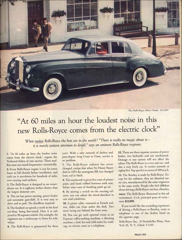
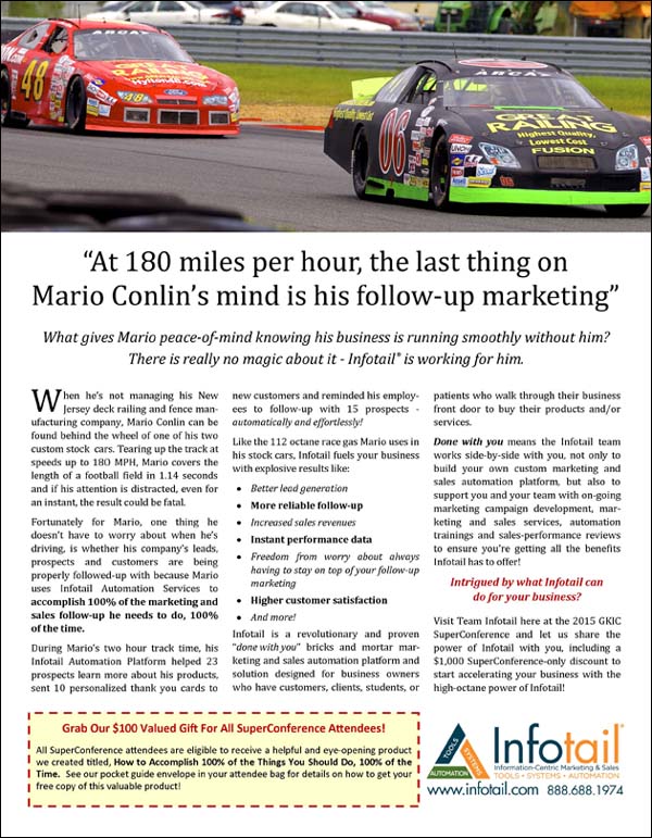
Since I needed a full-page ad for the GKIC SuperConference program, knowing that many who would be in attendance are fans of the classics, I used Ogilvy’s format for my ad, which quite a few attendees commented on.
But here is where things took a funny turn last week. A colleague of mine who I had not seen for several years, Paul Feldman of InsuranceNewsNet, came up to me and proudly showed me his David Ogilvy-inspired magazine insert.
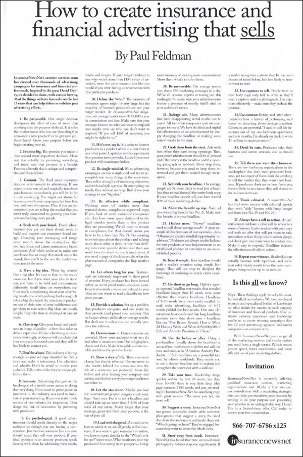
Paul’s insert mimicked the classic Ogilvy & Mather’s full page newspaper advertisements from the 1960’s and 70’s which were designed for a very specific purpose that is still relevant today (more on that in a moment).
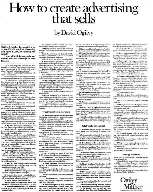
Paul and I were like two marketing geeks, as we proudly congratulated each other on our like-minded approach and ode to Ogilvy.
MARKETING CONTEST!
Because there was a specific method to my madness for my SuperConference ad (and I am sure the same one applies to Paul’s insert), I wanted to encourage my readers to study these ads and then see if they know “the psychology behind” both recent examples?
Obviously in this day and age of 140 character tweets and short attention spans, both of our Ogilvy-inspired marketing pieces fly in complete contradiction to the typical ads you see on today’s marketing environment.
Do you know what we are trying to do with our ads and how we are doing it? If so, leave a comment below and everybody who responds with the right answer by this Thursday, May 7, will receive a valuable gift featuring another famous copywriter (who is still with us), Dan Kennedy by email.
Good luck!
MARKETING CONTEST ANSWER REVEALED!
First a thank you for those readers who played and while all the responses were smart and insightful, only one reader, Jim Edholm, expressed the intent I was looking for. Per Jim, “As both you and Dan have pointed out, the person who isn’t interested won’t read past the headline, but the person who IS interested wants to be informed. He’ll read two pages or four if it continues to provide fodder for his search and justification for his want-to-buy rationale.”
BINGO!
The whole point of these long format marketing pieces is to engage the interested person who is willing to invest the time and mental energy the piece requires. Some marketer’s call this “whale hunting” and it means trying to identify the 20% of the 20% of the people who might be the right fit for your product or service.
In the case of the Infotail ad, this ad was in front of several hundred business owners at the GKIC SuperConference and we wanted to see if we could find a handful of business owners who would be perfect Infotail clients. Not only did we use the long-format, Ogilvy ad, but we also included a small book in every attendee’s bag. Our intention was to see who would read our in-depth message and who would respond. Rather than try to attract everybody, we were looking for those who were seeking quality marketing information.
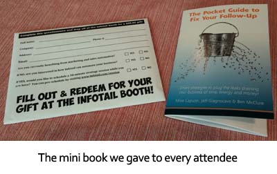
And respond they did. In an event where exhibitor traffic was low, our booth was constantly filled with prospects interested in hearing more about Infotail. Several mentioned the ad and many pointed out specific items in our Pocket Guide to Fix Your Follow-Up we gave out. By the end of the event, we welcomed several new Infotail clients to the family, including ironically, Jim Edholm (so not only did he get this contest right, he also proves this works).
Would I use this type of long-format marketing all the time?
It depends on the context and situation at hand. So much of effective marketing is about understanding when to do what. If you search the term “context” on this site, you will find several articles that discuss this, including this one.
I will leave you with this. In the event you find yourself in a situation where you know there are “whales” for your business, you absolutely must be intentional about putting the right bait in front of them to get them to self-identify and respond. A detailed, long-format message is only one tactic and one that must be used correctly.


Using a proven ad and editing to your situation.
If I can do it so can you.
Contrast and dissonance to focus the readers mind, attention, curiosity, focus and interest.
Always use an amazing headline and back it up with an editorial style advertisement with actual pictures instead of drawings. Essentially make it factual but interesting using big ideas and telling an amazing but true story. You can’t sell your product or service by being boring. Long copy still works even in this day and age of short attention spans!
You are selling the BENEFIT of owning/doing business with the advertiser. Not selling on price or 25% off type ad but selling the benefit first before any price is mentioned.
Great ad for a great company (Infotail). Looking forward to seeing you in Philly next month at the Fix Your Follow Up workshop!
Psychology behind the ad? It looks like some social proof tied to being in with the elite coupled to a little bit of reciprocity and micro commitment.
Thanks for sharing!
Thanks Brannon. Looking forward to meeting you!
Much like Ogilvy you guys are adding value by giving away great information in a summarized bullet format. The ads are long, but value-packed, resulting in the reader actually learning and reading the entire ad.
Plus you’re building authority.
Educate, inform, create curiosity and authority.
As both you and Dan have pointed out, the person who isn’t interested won’t read past the headline, but the person who IS interested wants to be informed. He’ll read two pages or four if it continues to provide fodder for his search and justification for his want-to-buy rationale.
You guys use the ad platform to address what keeps your prospects awake at night, and it offers an easily-attainable, proven solution to what, up to this point, seems a hopeless challenge. No blatant sales pitch, just the promise of a better life and all you have to do is respond to the CTA. (And I would surmise that the psychology behind the Infotail ad was that it was SPECIFICALLY targeted to the Super Conference attendees who have bricks and mortar businesses, and you KNOW…who your who is…they are there to learn how to improve their businesses as quickly and efficiently as possible, based on modeling what the experts are already doing).
I’d say the psychology behind the ad uses social proof to show what you can do, but it has the reader identify with Mario and how much there is to do for a business owner. While very quickly showing what Mario does in the free time you give him using Infotail and the reader probably envisions what it is they would be doing if they didn’t have to worry about their own follow up. The value of discussing their situation with you is helped with your end offers that disappear at the end of the conference (using scarcity).
Thanks for sharing the examples.
Hello Mike, David Ogilvy is a master of advertising. Congratulations to you and Paul for pulling off the inspiration so successfully. That has not always been the case. I have a CD of what has been said is a very rare interview with David Ogilvy where he describes how he came up with the famous pirate eye cover used to advertise a shirt company. What was even more interesting in that interview was how another company tried to simply rip off that same idea exactly how they used it and they failed miserably! Many do not understand the fine and delicate line of inspiration and having a swipe file. I look forward to receiving the materials you mentioned so I can see how two masters get the job done using some old but still current and proven techniques in their copy. Wish you the best at the Super Conference.
Hi Mike,
Ogilvy’s original ad creates an impression of exclusive luxury with real benefits (fancy being in a car that silent and nestling into the privacy and comfort!) and also depicts the attention to detail and total refinement of every aspect. It speaks directly to the target market.
You and Paul have done something similar using an evocative analogy (with a picture that reinforces it) and speaking to the issues your target market is thinking about, as well as providing useful information and enough detail to create a vivid picture of what life could be like.
You are both doing as Olivy did opening the readers mind to questions that they have not even thought of and giving them education based marketing to help them make a buying decision and take them to the next step in the buying funnel. Benefits will always give the buyer a reason to justify why they should trust you and buy from you..
Have a great day and thank you for all you great information.
Jonahan
Mike, I think what you mean about “the psychology” in your ad is the YOU’RE TALKING TO ME element. I’m busy (like Mario), I’ve got a successful business (like Mario) and I would really like to enjoy the freedom and lifestyle (like Mario) a successful business owner should.
Andrew
great job on your ads; also a huge fan of the classics, Ogilvy was one of the best; really liked your updates. very valid points re engagement, targeting and involvement. context, message to market match is critical. thanks, this was one of your best blog posts 🙂
Thanks Ken. Nice to hear from you! Hope all is well!