Why Marketing, Like a Big Green Egg, is Smart (part 1 of 2)
Marketing design and layout can have a huge impact on the effectiveness and response of your marketing promotions and advertisements. In this article, I want to show two good examples of marketing design and see if you can find the ONE, BIG smart thing the first ad does really well.
The other day I was on a flight and is customary I perused through the US Airways magazine and the Sky Mall catalog. On more than one occasion, I’ve seen some excellent examples of good advertising design and copywriting in both publications.
On this particular flight I saw two ads I had to share with you, because both use a very smart marketing strategy many business owners do not use.
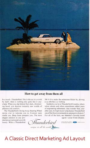
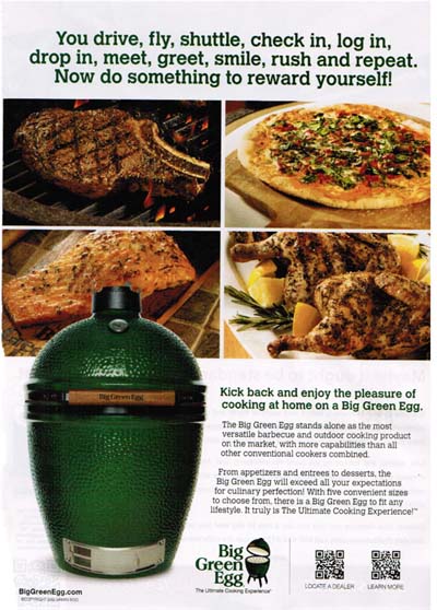
The first ad is from the Big Green Egg, which manufactures high-end outdoor cooking products. At first glance, the student of classic direct response advertising, will recognize a very familiar, three-part layout, which is reminiscent of the classic advertisements of the 1940’s, 50’s and 60’s, which includes Headline + Photo + Copy (or Photo + Headline + Copy).
A quick perusal of old magazines from the mid-20th century will show example after example of this three-part marketing design layout.

Today this classic marketing design still offers advertisers and clean, easy to digest ad with good eye flow.
The Big Green Egg company takes this design and updates it for 2012 by including QR codes as a response device.
Rather than focus on some flaws in the ad, I want to point out two key things they are doing very well and see if you can find the second one.

First off, I think the headline is pretty good. It’s meeting me where I was at when I read the ad, which was sitting on an airplane. This is a powerful concept and one you should consider when crafting your next headline.
Where are people going to be when they are reading your headline and what emotional hot buttons can you press knowing this?
The second thing this ad does well should be relatively simple to figure out, but in order to win, you must give me the more in-depth answer as to specifically what is going on in this ad that is so smart. It is a black and white answer, so with a bit of thought you should be able to figure it out!
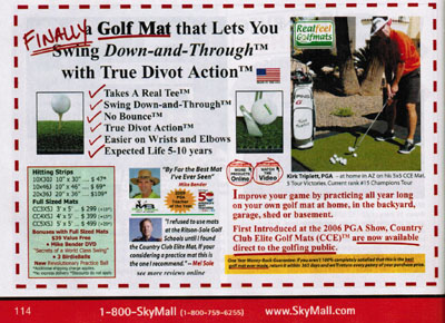
To help, I’m going to show another advertisement I saw in the Sky Mall catalog. This one featuring CopyDoodles®! Yep, I was quickly perusing through the catalog and thought I saw some familiar handwriting.
One of my mastermind members, Jay McGrath (www.realfeelgolfmats.com), placed an ad in Sky Mall and used CopyDoodles to draw the readers in. Jay (who was one of the first marketers to ever use CopyDoodles) is also using the same technique the Big Green Egg company is using in their ad, so you have two examples that show this very smart strategy.
Three Readers Will Win!
We will randomly pick three readers who send us the correct, detailed answer as to what the Big Green Egg ad is doing smartly. Their prize will be a seat in our upcoming Google+ Local webinar training which has been moved to Monday, November 5 due to Hurricane Sandy. This is a $97.00 value gift so leave your thoughts below and stay tuned for my analysis later this week!


Hi Mike,
Both the ads are directed towards the reader as they talk about how the products will help “you” i.e. with a better golf swing improving “your game” and the green egg “your expectations” and “rewarding yourself”.
There is very little talk about how great the company is and why they are fantastic – neither advert is about “them” it is all about the reader.
William
Use of lots of colorful graphics to draw attention and illustrate message.
I say it’s the photographs of the “reward” paying off the headline instead of the product- the result of the product instead of the product. Sure, the Egg is there, but the good looking food is the star, and shows that you can cook, beef, chicken, fish, and, well, pizza??? with the Egg. It’s all about the tasty results of cooking with the Egg.
Thanks for the reply William! Nice insights!
“Now” and “Finally” are great tools to draw the reader into reading about what’s changed (or could change). If you don’t get the reader to read more, they’ll never read about what’s improved, etc.
The Green Egg ad refers more to the reader (prospect); what they want and what they DESERVE…a reward for their hard work.
Thanks for your continuing thought-provoking info, Mike.
They are talking about the end result/benefits you will receive by using these products. The entire ad, including the pics and graphics is well aligned with the text to lead you down a path to actually feeling/realizing these positive results and how it will benefit your life.
Thanks for the note Andrew. Hope all is well in New Jersey! (BTW, you’re close).
I own a Big Green Egg and love it, so you had me at “hello”!
I think what BGE did well here, beyond a highly effective headline, is to use its very unique visual of the shape of the Egg and to get a direct response in using the QR code.
Carol, nice! Maybe post your best BGE recipe here 🙂
Hi Mike,
They used the QR codes to encourage them to find a local dealer near them and learn more about the specific product.
The second example had video links to learn more about the product and additional links about other items they may be interested in.
By using both approaches, they should be able to capture their email addresses, contact info etc when connected to their sites and use for immediate follow up. Essentially, the customer is being driven to them. Both excellent approaches.
The BGE ad clearly shows WIIFM (what is in it for me) by showing the mouthwatering foods and it’s versatility.
Hi Mike,
By its focused placement in the Sky Mall Catalog (located in the airline seat), the ad is primarily seen by those with discretionary income sufficient to purchase a product such as the Big Green Egg. During the flight this targeted group is being held captive within arm’s length of the ad during a time when they are likely pick up the catalog (even if only for a distraction). While seated on the plane, these qualified potential purchasers are also likely to be feeling the stress of travel and deadlines. While in this distressed state and paging through the catalog, the viewer is likely to notice the Big Green Egg headline which emotionally appeals to the viewer’s current pain. The headline connects with the viewer by empathizing with their pain while offering a solution/reward for their discomfort (without mentioning any product). The photos reinforce this theme while offering a temporary refuge from the stress and discomfort. The WIFM copy wastes no space on features or details, but provides just enough info to entice the viewer into taking immediate action to receive this well deserved reward/gratification. The viewer is most likely now visualizing being home and enjoying the sizzle/aroma coming from delicious treats cooking on The Big Green Egg. The website link & QR codes are “gateways to “this better place.” Once through the gateway and into the sales funnel, the viewer is now separated from the distraction of other ads and the sales process can begin using direct response lead generation and autoreponder/multimedia assisted conversion techniques. BTW, whether the prospect ultimately purchases The Big Green Egg or not, their valuable contact information can be added to a targeted list for future marketing or other monetary purposes.
Excellent feedback Jack! Thank you.