How to Get More Business From Your Business Card Layouts!
It’s a fact that almost every business owner and entrepreneur uses a business card as part of their marketing arsenal.
The typical business card is the most ubiquitous 7 square inches of marketing in the entire world – yet it’s also a fact that 98% of business card layouts stink when it comes to doing something really important for the person carrying them – creating business!
Think back to when you created your first business card… what were you concerned with?
Your logo?
Using pretty colors?
What title you should use (e.g. President, Owner, etc.)?
Smart entrepreneurs who study direct marketing know the power and opportunity of every touch-point with a prospect or customer and they start with their business card layouts.
The key is to think direct-response and create a business card that offers the person you’re giving it to – a chance to respond to something.
In the rest of this article, I will share 7 secrets for creating a powerful business card that will make you stand out and add dollars to your bank account.
Secret #1 – Don’t Use Free Business Cards
You know the ones I am talking about. The offer is so tempting, I mean, “it’s only a business card, right?”
These are the cards, like the one above, that have the no-so-little tag line on the back such as, “Business cards are free at…”
So what’s your first impression when somebody hands you one of these numbingly boring business card layouts? – “Geez, they must not be doing so well if the best they can do is give me a free business card” – or something like that, right?
In the end, free business cards and free business card layouts will end up costing you money. Don’t use them!
Secret #2 – Create Specific Cards For Specific Purposes
Printing high-quality, custom business cards is fast and inexpensive. Any local printer can create them for you and there are a ton of Web-based companies that have 24 hour turn-around.
My advice is to have different business card layouts for different reasons and know your “reasons why” you need a specific card for a specific event. Ask yourself this important question:
“When I hand somebody a card – what is the one single action I want them to take?”
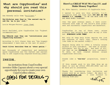
Recently I attended a copy writing seminar. One of my goals was to find suitable joint-venture partners for promoting CopyDoodles®. I specifically created one of my famous “mini-brochure” business cards specifically for this event. My local printer only printed 25 of them and they were laser-focused.
Consider creating business card layouts where you:
• Make a special offer
• Offer a free report, CD or gift
• Create an invitation for joint-venture partners
• Ask for referrals, etc.
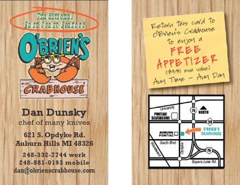
Secret #3 – Double the Power with Double-Sided Business Card Layouts
If you only take one idea away from this article – this one is it!
I highly recommend every business card you print be a double-sided business card (printing on both sides).
Why?
Because you’ve immediately doubled the amount of space to have a clear, relevant marketing message AND because most people don’t do this, so your card will stand out! Makes sense… doesn’t it?
Here are a few outstanding ideas of what you can put on the second side of your business card:
• A time-based offer
• A powerful testimonial
• Business-specific tips
• Photos of happy customers
• An area where you can write in a personal note to the person you’re giving it to
Secret #4 – Don’t Use Paper
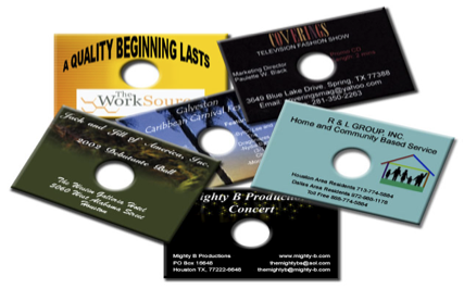
Get this; your business card doesn’t have to be the traditional paper card. Today, you can have a business card made out of metal, plastic, magnets, even wood.
For years, I carried a business card CD-ROM, which is a computer CD (or DVD) in the shape of a business card, like the ones above.
My card contained a 5 minute video that auto-played when inserted into a computer and then immediately took the viewer to my web site after the video was over. I always got a decent response whenever I handed these out.
The biggest advice I can offer you with regards to creating a card out of something other than paper is to have a congruent reason-why you’re doing it. If you can match this reason with your main offer or business message – you’ll be ahead of the game!
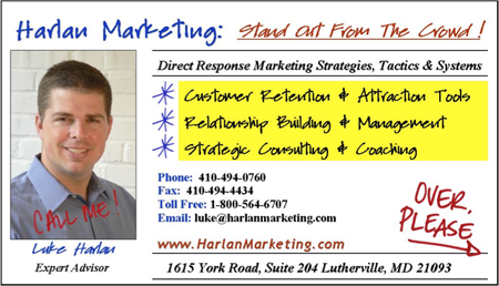
Secret #5 – Add Emphasis with CopyDoodles
Smart marketers know CopyDoodles are the world’s fastest and easiest way a personal, “me to you” look. They also add visual spice and a “wow-factor” to your marketing.
Use CopyDoodles and our matching CopyFonts to create unique-looking business card layouts that don’t blend in with the masses, but stand out and get noticed.
Attract the reader’s eye to specific areas of your card with hand-drawn arrows and stars or add a personal handwritten note like “Call Me” for a unique-looking business card.
Secret #6 – Add Personality with Caricatures
I believe every business owner and entrepreneur should have a caricature of themselves.
C’mon folks… life’s too short to be boring and cookie-cutter. If you want your business to be invisible to the world… just do what everybody else in your industry is doing!
You can get a high-quality, custom caricature for less than $150 if you search the Web. They’re a fun way to add some quirky personality and visual eye-candy to your business card layouts.
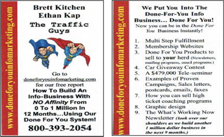
Secret #7 – Create a “Mini-Brochure” Card
My last secret is a big one – literally.
Who says business card layouts can only be 2.5 inches by 3 inches?
Did you know you can create a mini-brochure that has the same footprint as traditional business card layouts?
By simply adding panels to your card, you can easily 2x, 3x or 4x the area for your message. I’ve used mini-brochure business card layouts for years and the one I created most recently was a double-sided, three panel card.
This means I was able to get three business cards worth of content into something when folded down was the same size as an ordinary business card.
Now I don’t advise you to make a mini-brochure your primary card, but they do make sense when attending events or when you want to make a BIG impression.
You’ve gained tremendous insights by reading this far and I trust you will take action and make a few important tweaks to your business card layouts.
If you would like to see a powerful, 9 minute video where I go into more detail and share three other secrets about boosting the power of your business card layouts, visit:

This is the best article I’ve ever read on this topic. Everyone should read and follow your advice on this topic, Mike! There is this “thing” going around the Internet. This notion that a business card isn’t necessary. I don’t want to call it a myth or disinformation, because those labels don’t fit all that well but, at the very least, it is horrible advice!
Great stuff, really! I’m going to apply several of the ideas immediately.
John
John, thanks – I appreciate your feedback. Fact of the matter is most people don’t know how to use a business card correctly, therefore they feel its not necessary, etc. Done right, they can be very powerful little tools. Check out my video on the same topic at http://www.mikecapuzzi.tv.
Hi Mike, Great article and even better that you had pictures to show what you were talking about! I recently attended the Entrepreneur magazine conference and was surprised that most people’s cards were very boring and not a good representation of them and their brand. Lots of people commented that I have all of my social media links on the back of my card ( which I have had for years now). I would have thought that by now everyone would have started doing that but I guess being in marketing I am an early adopter. I would add a bonus tip: If you aren’t following Mike’s tips don’t wait until you run out of cards to do this, order them NOW!!!
I like your idea of the cards made specifically for an event and will try that for my next event.
Stacey – excellent points! Thank you!
Mike, this was a fantastic article. I have been a long-time crusader for more effective business cards, and you hit the nail on the head.
You may be interested in checking out http://www.TransformYourBusinessCard.com
Brent – thanks. I’m gonna grab your ebook and check it out. If it’s as good as it sounds, I may feature it in an upcoming 3 in 3 episode on MikeCapuzzi.tv.
Mike,
Great tips! The newest trend is adding a QR codes to your business card have you heard about these? Real powerful when used with videos…
Thanks Terry. You’re right… QR codes are a great thing to add to marketing and I think we’re definitely going to see them a lot more in marketing, especially on business cards! Are you using them on your business cards or marketing currently?
Fantastic tips! I will definitly be using these to increase my traffic and sales!
My biggest issue with peoples business cards
is people who make their name in font size 14 but their email address and telephone number in font size 6…Give me a break, if i can barely read the number, i am not going to call or email you. Make it easy to read the darn thing folks