The Art of Designing Envelopes That Stand Out!
Marketers who send a lot of direct mail know there is an art and science to the design of the envelope. If you were to study any of the great direct mail marketers, each would reaffirm the critical importance of the design and look of your envelopes and how certain design principles can result in profitable increases in response.
If you were to pick somebody off the street and ask them what the purpose of the envelope is in a direct mail package – they typically say its job is to hold the mailings contents together and get them delivered as intended without them getting lost or damaged. And they would be right. This would be the “physical” job of the envelope (and an important one at that), but it would not be the answer marketers are focused on.
Ask any sharp marketer what the purpose of an envelope is and he or she will tell you it’s to ensure the recipient notices your direct mail and opens it immediately.
This is what your envelopes must do and in today’s world with all of the junk mail that we receive, this is no small task. Whole books have been written about envelope design and strategy and if you’re so inclined I would suggest you seek out books written by Dick Benson, Herschell Gordon Lewis, Denny Hatch, and Dan Kennedy. You can also download this free mini-swipe envelope design file I put together of smart envelope design strategies. It includes a number of envelopes that definitely stand out and get the attention of the recipient. Here’s a few notable envelopes that are worthy of study:

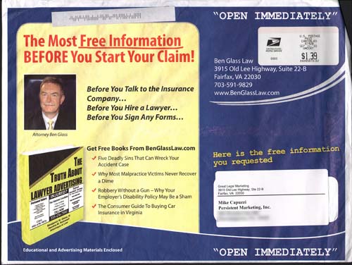
My friend and smart marketer, Ben Glass creates some great looking envelopes for his law practice. How many lawyers do you know that send out such personality-driven type mail? I like the fact he’s using his photo, showing an image of the free books available and reminding the recipient the enclosed information was information they requested. Very smart!

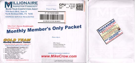
My friend Dave Debeau uses both sides of the envelope for his member mailings each month. I love his use of photos and testimonials on the second side of the envelope to further prove just how valuable his membership program is. Using both sides of an envelope is a smart, cost-effective strategy.

Another smart marketer is Mike Crow. This envelope is sent to members of his group and it contains his monthly membership content. The interesting thing Mike does with his envelopes is he prints up a bunch of generic envelopes with generic, evergreen content that never expires and then uses labels on BOTH sides of the envelope to customize for that month’s content. This is a “guerrilla printing strategy” that saves Mike money on his printing, yet gives the recipient a timely, customized envelope.

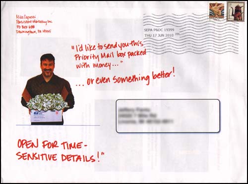
I included this last example, which is an envelope I sent out for two reasons. It uses a quirky, eye-catching photo (me holding a box of money) and it uses simulated handwriting to make it appear as if I literally wrote on the envelope. Not sure why I did not personalize the handwriting to the recipient, which is definitely something I would do, if I was doing this today. Think about how you can use fun photos in your envelopes to get attention and get opened.
What envelope design strategies do you like to use?
Leave a comment below and let me know what has worked in your business and marketing. The person who shares what I consider the most unique envelope design idea will receive a free copy of my brand new Profit with PURLs course (value=$299). I will post the winner right here in the comment section and don’t forget if you want to see more examples of smart envelope design strategies, click here to download a free mini-swipe file. Enjoy!

Mike,
Great post, and the free download is outstanding. You continue to deliver more value than I though I possible. Even the free blog posts are worth their weight in gold.
Thanks,
Jim Hart
I find advertising with pictures of money on it particularly crass. I believe it creates a world where people believe money is more important that service to others.
Great information Mike! Thank you for putting this together. Can you give us some possible sources for custom envelope printing?
Have a great day,
John
Thank you Jim!
Bruce – it’s all about the right context and what makes sense. You cannot make a blanket statement (other than to express an opinion) about any one particular type of strategy. I was just working with a client this morning trying to get them out of their own way with their marketing. They kept telling me they could not do something because it was not appropriate to their audience. As soon as I started digging deeper, they had no factual or specific data about why it would not work – they just FELT it would not work. This is a dangerous place to be when it comes to marketing. I know, cause I have been there. Thanks for the response.
John – I can recommend City Blue (www.cityblue.com) and my personal printer, Mike Schnitzius (www.mikelmailings.com). Other than those two, I would Google it.
What I once used in the distant past on an envelope – a drawing of a goat eating the envelope with a look on her face as if to say “how dare you deprive me of this!” with the words hand printed “Hurry and open up before Mabel’s dinner time!”
It was a party invitation, promising fun, excitement and surprises, and we had a huge turnout.
Thanks for your always wonderful inspiration.
I have always used a plain white / ivory envelope with very little text and no graphics (or cartoons) and just a simple sentence / headline to create curiosity such as:
“Open now! It’s not every day you are a GUARANTEED winner”
“Are you making this one critical practice building mistake?”
The designs shown here – except yours of course Mike! – always appear to my mind to be too “busy” and would make me immediately think junk mail (or credit card offer) so I have never really tried them but I shall try a more visual approach to test the outcome on my next mailing.
Ruth – love it!!!! Thanks for the idea.
William – there is a time and place for both designs – busy or something more simple. I too have used just a plain envelope with a small piece of teaser copy. Some times less is definitely MORE! Thanks.
Thanks Mike for another marketing idea bonanza…swipe file heaven. I will be referring to this pdf frequency.
Mike, how about if there was a way to kind of “scruff up an envelope” to make it look like it was thrown away with a message that says something like: Since you did not read me the first time, here I am again”. Even if it was sent for the first time, it would still get some one’s attention to read. I also have a quick question. In your experience, do transparent Envy packs out pull customized envelopes. I’m wondering because in the Envypak, you can see 8 1/2″ X 11″ X 2. A lot of extra space. Thanks for the swipe file as well.
Hi Mike,
Thanks very much for this thought provoking post. Well done!
The .pdf is very impressive.
I can see that I can have a lot of fun with this.
The information will not be wasted.
Thanks once again.
All the best,
Peter.
Edwin – while back I bought “mini plastic trashcans” and did exactly what you are suggesting. Check out http://3dmailresults.com to get them. Regarding the clear envelopes outpulling regular ones, I have not tested. I like using them for SMART Ideas because it allows my subscribers to see all the goodies before they even open it.
Peter, thank you and I am glad you found it useful!