1930s Advertisement Examples: Can You Pick the Winner? (part 2 – the answers)
I want to thank everybody for participating in the advertisement examples contest I described on my recent episode of CopyDoodles TV.
What follows below is my analysis into the results of each of the six split tests done on advertisement examples I mentioned on CopyDoodles TV. Of course, the real reasons why people respond to one advertisement versus another are buried deep into human psychology, timing and other factors we’ll never know, however, in this article I will give you my best reasons why one advertisement out-performed another.
And while some of the advertisement examples answers may surprise you, a closer look at each ad after knowing the right answer is useful as you prepare your next marketing campaign!
If the study of what design factors affect response intrigues you further, I would recommend you check out my Copy Boosting Profit Secrets and Response Boosting Profit Secrets. These two unique courses take an in-depth look at HOW marketing looks and the effect on response.
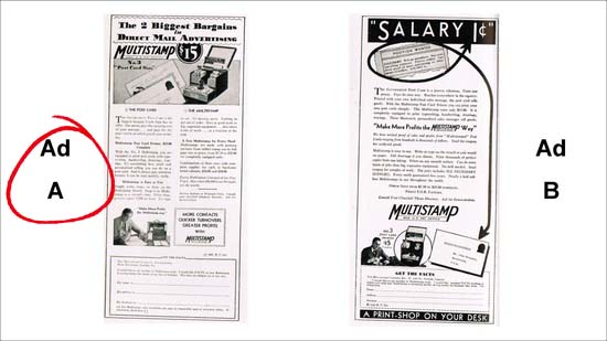
Advertisement Examples #1: Ad A outperformed Ad B by 3:1
These two advertisement examples were run in the same publication at different times of the year. Ad A, the first to appear, pulled more than 1,050 inquiries. Ad B pulled 339.
While no definitive reasons are given for this considerable difference of the advertisement examples, I believe Ad A does a better job of grabbing attention with a stronger headline with an illustration. Ad B has a “cute” headline that doesn’t really offer any specific benefit or reason why I should read further.
I also think Ad A is easier to read and is a good example of using subheads and two columns for making it easier for people who like to skim.
SIDE NOTE: Ad A carried a line at the bottom of the coupon, “A few Multistamp sales territories are open to responsible men of executive ability. If interested, check here.”
Ad B did not carry this line. Approximately 150 inquiries were received from men seeking distributorships.
Adding this “check here” on Ad A’s coupon allowed them to collect even more relevant data at no extra expense from those responding. Smart strategy!
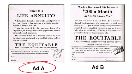
Advertisement Examples #2: Ad A brought in six times as many leads as Ad B
Just about everybody incorrectly guessed the answer to these advertisement examples. Evidently, there is something about Ad A’s specific question headline that attracted attention. The development of income insurance in 1933 was still in its pioneering stage and an offer of information apparently proved welcome.
In these advertisement examples, the use of three indented paragraphs instead of a single justified paragraph in Ad B makes it easier on the eye and the copy in Ad A is stronger and supports the ad’s call to action better.
Looking at the coupon, the direct mention of the booklet explaining Equitable Annuities increases the effectiveness of the ad versus the offer in Ad B.
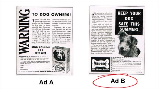
Advertisement Examples #3: Advertisement B outperforms Ad A by 60%
Unlike the second test above, just about everybody got the answer to this set of advertisement examples correct! Couple of things to point out on the advertisement examples above.
The opening line in Ad B carries authority by citing what a veterinarian would say about the summer months. This is stronger and more compelling than the copy in Ad A.
Ad B uses a picture of a dog that helps grab attention.
While I am not a big fan of reverse print (white copy on black background), the minimal use in this headline works. This headline is much easier to read than the headline on Ad A, plus it’s a stronger, more benefit-oriented headline.
I also like the copy in the coupon on Ad B. “Certainly, I want to keep my dog safe this summer…” Who wouldn’t want that?
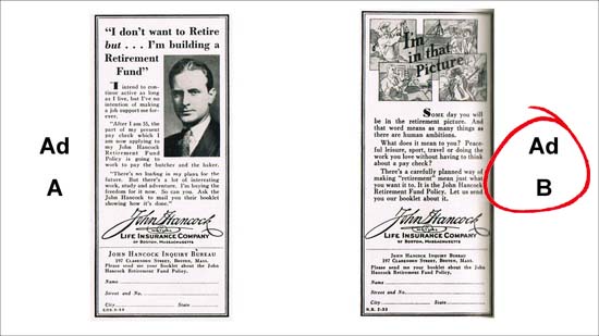
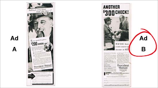
Advertisement Examples #4: Ad B outperformed Ad A by 100%
This test was another one that may surprise you, especially since at first glance of the advertisement examples, Ad A is easier to read then Ad B.
While Ad A uses a picture (which is a proven attention-grabber) this particular picture does little to add to the message. A more personal approach may have proved more effective with this ad.
The copy in Ad B strikes an emotional connection with readers by tapping into “leisurely life.” Look closer to the illustrations in the headline – these images are much more compelling than the photo in Ad A. It seems obvious that this focus on leisure has more appeal to the average human than the idea of sticking to a job forever (per the headline in Ad A).
This is an important question for everybody. What is the deeper emotional benefit your product or service offers?
Advertisement Examples #5: Ad B brought in twice as many coupons as Ad A
These advertisement examples have interesting results that may surprise you (it surprised me). In studying these two ads, I have a few comments.
Ad B’s headline is stronger than Ad A. Ad A uses a more “cutesy” approach that is less personal than Ad B.
My only other comment is that the use of the fisherman in the first of the two advertisement examples may have only appealed to only a limited group of prospects, while the other ad was more universal in its appeal. These advertisements were run in city newspapers, not niche publications. I am sure if these tests were conducted in a fishing magazine, Ad A would have out-pulled Ad B.
This is why it’s so critically important to understand your target market and use photos, illustrations and copy that’s relevant to them!
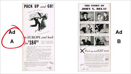
Advertisement Examples #6: Ad A received 3.5 times more leads
This is another one of the advertisement examples that somewhat surprised me, but closer inspection reveals several reasons why Ad A is the winner.
During first glance at the advertisement examples, Ad A tells a more complete story than Ad B. Ad B’s headline is weak. Plus the use of different fonts and bold and italics is much more eye-catching in Ad A.
The lively illustration of the couple with joy on their faces and having fun has more appeal than the stern-faced multi-panel comic.
The copy in Ad A is much more specific and compelling than Ad B and the offer “Don’t say no until you’ve read this book” is strong and direct.
Final comment
I hope you enjoyed this fun exercise and review of a few classic advertisement examples I pulled from the 1930’s. While much has been said about the average attention span and intelligence of people in the 21st century compared to those in the previous century one thing is crystal clear. What grabs readers’ attention and what fulfills their emotional needs has not changed and by studying past successes and advertisement examples can help us all create our own future successes!

Mike, thanks again for this Ad contest and review. Another fun thing to do would be to have examples of Ads through the different decades 40(s) and up to modern to compare how society’s tastes have changed and been influenced for the better by great marketing examples.
John
If you send a message to everyone, somebody may answer, but nobody does.
If you send a message to someone, somebody listens, and nobody loses.
Right, Mike?
Hi Mike, well thought out evaluations of the six ads and the difference in their respective pulling power. Some great lessons here. Next time you do this I will be sure to take the time to download and study each one before “guessing” the winner! Grateful and a little wiser, Alan
What a great lesson approach. Very helpful. thanks so much.