Think Small for Big Marketing Response!
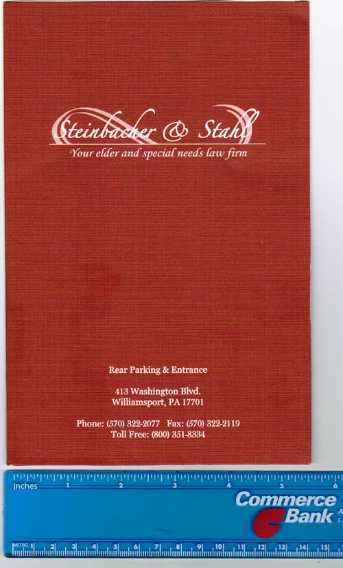
Recently I received what I thought was a great look marketing piece from one of my mastermind members and elder law attorney, Julie Steinbacher of Steinbacher & Stahl.

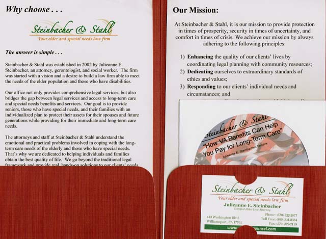
What caught my attention immediately was the size of the marketing piece, in this case a 5.5 inch wide mini pocket folder. I had never seen a pocket folder this size and it immediately stood out (which is a critical first step to any marketing).
Inside the folder was a marketing information kit, which included an audio CD, some firm information and her business card. Overall a very well designed and thought out piece.

As soon as I saw it, it prompted me to write this article on an important concept many business owners and marketers gloss over, but can have a huge impact on whether or not your marketing piece gets noticed.
The size and shape of your marketing pieces should be a consideration when coming up with them and rather than default to standard sized items (e.g. letter-sized paper, etc.) think about how you can do something different to stand out.
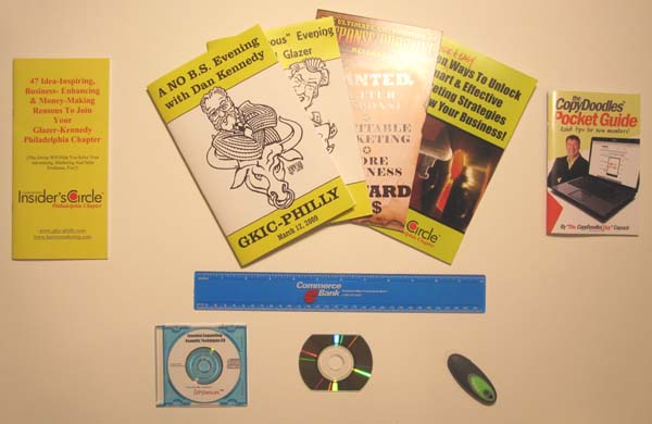
I’m a fan of creating and using odd-sized marketing pieces and as I prepared this article, I pulled a few items I’ve created in the past to kick-start your own ideas…

Starting from the top left, this was a 4 inch wide by 8.5 inch tall booklet I created as informational booklet for an entrepreneur’s group I led. I designed it specifically to be this size, so business people who attended the meeting could put it in their inside coat pocket and so I could always have one at hand myself.
Moving right, these are four examples of other booklets or “shooks” (short book) I’ve created. Closed they are 5.5 inches wide by 8.5 inches tall and when they are opened they are basically printed on an 8.5 x 11 inch sheet of paper turned on its side. My current use of this booklet is for a product catalog I put together of all my products.
On the top right is my new CopyDoodles® Pocket Guide all new CopyDoodles members receive in their New Member Welcome Kit. The closed size is 4 inches wide by 6 inches tall. I wanted something different that stood out in the Welcome Kit and this mini book does that quite well.
Over the years, I’ve been a big fan of mini CD-ROMs and business-card CD-ROMs. Handing somebody a business card CD, loaded with a video, demo, etc. can be very powerful and was one of the first strategies I used when launching CopyDoodles back in 2007.
The last item is a USB drive, which can be loaded with all kinds of digital goodies and branded with your company information. They definitely don’t get thrown away and their small size makes them easy to mail or carry with you.
Here is a short checklist of marketing pieces that can have smaller or odd sizes:
- Books and reports
- Envelopes
- CDs and DVDs
- Information kits
- Business cards
- Direct mail pieces
The takeaway I want to leave you with is to try not to always default to standard and traditional sized marketing pieces. Remember, think small for big response!
If you’ve ever used or created a small or odd-shaped marketing piece, let everybody know what you did! Leave a comment below and tell us all about it!
+++++++++++

Yes you gotta love this stuff… Mike
Size does matter.
Dr. Carney
Good article Mike! I like the idea of going small… but I think in the case elder law attorney, Julie Steinbacher, she should have went with extra LARGE. My stereotype is that the elderly have a harder time reading small print.
Thanks, Mike. I copied your article and posted it on my blog, giving you full credit of course!
Indeed Doc!
Eddie,
Good point, however everything in the kit is printed at normal size e.g. 12 pt font. I can tell you Julie has a very successful practice and is a very good marketer. If something is not working, I am sure she would change it immediately.
Thanks Beverly!
I love the simplicity of this blog. Thanks.
Mike, great post and reminder as well. A reminder to do the opposite of everyone else. When everything else gets bigger and bigger, going smaller will definitely get noticed and even stretch out the $$$ a little more so you can do even more with the piece that is sent out.
I know this post is pretty old, but I just came across it. I’m creating a direct mail campaign with 5 mailers spaced out a month apart. I am planning to use a 3 1/2″ x 5″ envelope with a “letter” insert inside. The outside envelope will be handwritten or “handwritten” with a personalized font and the inside will be “handwritten” with a large type font and a brief message. I was planning to include our business logo/letterhead at the top. Thoughts? 🙂 Oh, and my target market is above 40, motivated home sellers.
Amanda – sounds like its a well thought out idea. My only comment would be to exclude the letterhead and maybe just use your name as the letterhead. More personal. Good luck.