Why Marketing, Like a Big Green Egg, is Smart (part 2 of 2)
Earlier this week, I posted an article that shows two advertising examples that use a specific marketing design strategy quite well.
If you have not seen this marketing design strategy article, you can check it out here:
https://mikecapuzzi.com/big-green-egg/
So what’s the big, important strategy both ads are using?
Hopefully the first answer was rather obvious. Both ads are making excellent use of photographs.
Using quality photos, hand-drawn doodles and illustrations is an important marketing design strategy, which many business owners tend overlook. These graphics are often times the #1 eye magnet in an advertisement, web site, sales letter, etc.
According to a 1991 Roper Starch Worldwide Study:
- Advertisements with 50% graphics were recalled 30% more often than ads without graphics.
- Advertisements with 75% graphics were noted 50% more.
- Showing a product graphic attracts readers 13% more.
- Photographs are the most compelling type of graphic.
Here are a few ways you can use photographs in your marketing promotions:
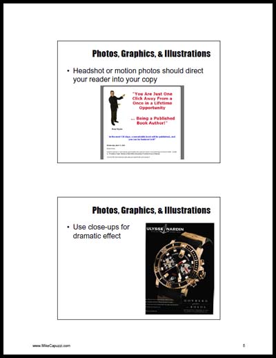
- Showing your product in action
- Close-up photographs for a dramatic presentation
- Showing how to install your product
- Before and after photographs
- Interesting and eye-catching photographs
- Pictures of people happily using your product or service
- Pictures of the benefits of your product or service
Take note of that last bullet, because that was the answer I was looking for in the first part of this article. The big strategy the Big Green Egg ad and the golf mat ad used were photographs showing THE BENEFIT OF THEIR PRODUCT!

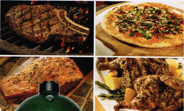
Who can pass up looking at the juicy steak, succulent salmon and crispy chicken photos in this ad?
While they could have shown product feature shots, they instead chose to show how the Big Green Egg cooks delicious food, by showing the cooked food!
This is a perfect example of “selling the sizzle and not the steak.”
Jay McGrath is doing the same thing in his golf mat ad. He is showing a picture of the benefit of the “swing down and through” feature of his mat.
So the big smart idea both advertisements are using is:
Quality photographs showing the BENEFIT of the product!
Congratulations to the following readers who got the right answer.
Kevin: “I say it’s the photographs of the “reward” paying off the headline instead of the product- the result of the product instead of the product.”
Bruce: “They are talking about the end result/benefits you will receive by using these products. The entire ad, including the pics and graphics is well aligned with the text to lead you down a path to actually feeling/realizing these positive results and how it will benefit your life.”
Linda: “The BGE ad clearly shows WIIFM (what is in it for me) by showing the mouthwatering foods and its versatility.”
Jack: “The viewer is most likely now visualizing being home and enjoying the sizzle/aroma coming from delicious treats cooking on The Big Green Egg.”
Congratulations to these readers for identifying the big smart strategy.
If the idea of using photographs intrigues you, download this PDF that includes a part of a entire day presentation I gave on the 25 different copy boosting techniques. It goes into greater detail on smart ways to use photos in your marketing. If you’re interested in the Copy Boosting Profit Secrets course, click here.

