Is Your Copywriting & Direct Marketing Readable?
When sitting down to write the copy for letter, web site, postcard or any direct marketing media, most marketers focus 100% of their attention on the words they are writing. Without a doubt, the written message is ultimately critical for achieving high response rates, however HOW YOUR COPY LOOKS is also important for achieving the best results from your direct marketing.
One of the critical mistakes made by copywriters and marketers who don’t understand the importance of what I call “copy cosmetics” is creating copy that is hard to read. Not because what it says, but because it’s physically hard to read.
Think about this for a moment. You either spend your time or hard-earned dollars on a professional copywriter to craft a unique and compelling direct marketing message. When the last period is added, you breathe a sigh of relief, and consider your job done.
Not so fast….
Now comes the important task of making your direct marketing copy:
– attention-grabbing
– personal-looking
– and easy-to-read
If you can accomplish these three goals, you’ve definitely increased the chances for a higher response rate versus not spending the time on the look of your copy and direct marketing.
Let’s look at a few direct marketing examples that came across my desk recently and study where they fall short in the copy cosmetics department.
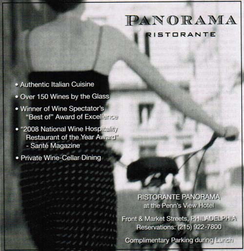
This first example is an ad for a local restaurant in Philadelphia Magazine. Sure, there’s a classy-looking black and white photo to grab your attention, but can you read the copy? Not only is the font too small it’s also “reverse copy” meaning light colored type on a dark background. Knowing the demographic for this high-end restaurant probably doesn’t have the best eyesight, does it make sense to make the ad so unreadable?
Imagine spending the money on creating this direct marketing advertisement and running it in a high-priced magazine, only to fall short on readability.
This is a classic advertising blunder made by advertising agencies who don’t understand copy cosmetics. Their big goal is a nice-looking ad, not response (if you don’t believe me, look at this ad closer and tell how this ad could be measured).
Reverse copy is a definite response-killer and should be used only in certain ways and sparingly at most.
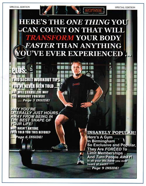
Here’s another example of a nice-looking “special report”, complete with the buff gym owner, but because of the heavy use of reverse copy, it makes the copy very hard to read, even for a younger target market.
Using full background photographs in marketing sure does look nice, but be very careful when placing copy on top of them and if you’re going to try to make somebody read the copy, keep it short and simple and as readable as possible.
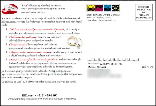
Finally, here’s another classic, “let’s make hard it for the reader to read” mistake. This time it’s a direct marketing postcard I received in the mail from a local printing company (you’d think they would understand how to make a postcard easy to read, wouldn’t you?).
Besides not following proven direct marketing principles, check out how the font choice for their five “fresh ways.” Can you read them? Even with the actual postcard in front of you, you would have a very hard time. I have no idea why they decided to use a red, script font for these very important items for their postcard, but their selection of font definitely kills response. Make sure your font choices are readable to your target market and based on the media you’re using.
Not wanting to end this article on a negative note, this postcard does use one or two direct marketing techniques correctly. The black on white paper contrast helps make the overall piece much more readable and their use of a serif font for the body copy is a smart choice, since serif fonts (like Times New Roman, Courier, etc.) make offline direct marketing much easier to read.
The bottom line is the right use of copy cosmetics can make or break your direct marketing piece. Online or offline, it doesn’t matter. You must understand what increase readability and response and what decreases it.
If you want to know the right way to improve the response of your copy and direct marketing, check out my CopyBoosting Profit Secrets home study course. This is the recording of a one-day workshop where I focused on showing the right way to use more than 20 copy cosmetic techniques to improve the attention-grabbing power, readability and response of your direct marketing and copy. Grab your copy at http://www.mikecapuzzi.tv/special


Mike, you are saying it is better to use a serif font on print advertising rather than something like ariel or helvetica? I thought the simpler fonts were supposed to be more legible. Appreciate any comment and thanks for your article.
Kent, study after study has shown that serif fonts are easier on the eye for print materials. So a good rule of thumb is to have your body copy in a serif font for offline marketing. You can use sans serif fonts (say in a headline or subhead), but just know that sans serif fonts are harder to read in print materials – especially in body copy. BTW, if you study any of the most successful print ads and sales letters you’ll see they use serif fonts for the body copy.
Great tips Mike – I expected to see something about the “gray wall of words,” but I expect that’s for a different post.
I personally wouldn’t have bothered to try to read any of the three examples you posted.
In body copy, use serif fonts (Times Roman, New Century Schoolbook, etc.) when you are putting it on PAPER.
But when you’re when your copy goes on a website, or a white paper, case study, etc. that is viewed online, use the sans serif fonts (Arial,
Helvetica, etc.).
That’s because computer displays often lack the high resolution to clearly present the fine details of serif fonts, causing them to be blurry and distorted — hence, hard to read.
On hard-copy print media, the serifs make the type easier to read.
Also:
When possible, be generous with type size. I use 16px (pixel) type size as my default for web pages, and 12-point on print. Remember, not everyone has laser-sharp eyesight. And ALWAYS use black or dark type on a light-colored background. Your readers will love you for it. (See my website for how I do it.)
And NEVER NEVER NEVER use light type on a dark background. It’s a major problem on websites. Medium brown type on dark brown, or red on black is commonplace. Even Hewlett-Packard has microscopic type size in white (or gray?) on a black background that’s nearly impossible to read!
And they’re supposed to be in the printer busienss, for crying out loud!
(Full disclosure: I used to work at HP in technical publications as a
senior technical writer and learning-products engineer.)
Clark, you’re absolutely right. Thanks for the detailed post! Mike
Thanks Marte! Mike
Great comment Clark. I knew that you were supposed to use sans-serif for web copy but never really knew why.
Mike – thanks for the information and examples. I am a fellow Philadelphian and love Panorama restaurant for their wine selection. Too bad they screwed up their ad!
Yves, Panorama is a good one! And they didn’t screw up their ad, their agency did. But it further reinforces why all business owners need to understand the importance of design and copywriting.
Right!
So very glad to see other copywriters speaking out about the whole issue of visuals. It’s almost every time I get a copy critique job these days that I have to first send it back with notes about visuals and readability before I can even begin. As much persuasion as there is under the hood, there’s almost an equal amount in plain sight..