Get Attention with Advertorials
“It has been found that the less an advertisement looks like an advertisement, and the more it looks like an editorial, the more readers stop, look, and read.” – David Ogilvy
I always appreciate the business owner who “gets it” when it comes to marketing. Especially a local business owner, who’s in the game every day, trying to get attention, get response, get results.
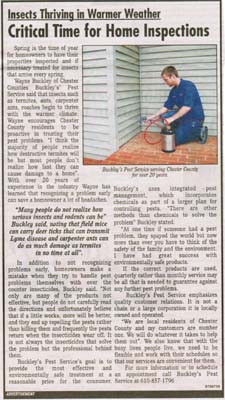
This past week, I was perusing the local paper and came across this pretty decent example of an advertorial (click to see larger version).
In case you are not familiar with advertorials, they are advertisements designed to look like articles in the publication, with the intent of catching the readers’ eyes by not looking like every other add in the publication.
Advertorials have been around for decades and I’ve put together a mini advertorial swipe file of a few examples I’ve collected over the years. You can download it here. If you peruse through these examples, you’ll see a few strategies you should use when creating your own advertorials, including:
- Making it look like a news item or article
- Setting headline like a newspaper headline
- Setting the copy in newspaper type
- Creating it in same style as the publication
- No logos or blatant images that screen “this is an ad!”
- Having a clear call to action
Let’s go back to the Buckley’s Pest Service ad and let me point out several smart things they did in this advertorial (I am then going to ask you to find the one area they could instantly improve this advertorial).
- Good article-style headline in a big, bold font
- Decent use of a photo and caption, however given the context of this article, they probably could have used a more dramatic photo – maybe of termites eating through a house or something like that. But they still get a B for use of a photo and caption.
- Nice use of a “pull quote.” This is a copy cosmetic technique where you “pull” an important key phrase, sentence or quote found in the body copy and make it stand out.
- “Sounds like an article.” The copy is written in such a way that it sounds like a third-party article.
- As with most advertorials, the publication requires the “ADVERTISEMENT” signification to make sure readers are aware it’s an ad.
Overall, a very good example of a local business owner using a time-tested marketing strategy to get attention and get response.
However, there is one weak area that stands out dramatically in my opinion. Something that could easily be fixed in a few seconds and I guarantee response would increase. Do you know what it is? Leave your ideas below and the first person and the fifth person to get the right answer will a digital copy of my Response Boosting Profit Secrets book where I show smart strategies like advertorials and much more for creating stand out marketing.
UPDATE: We have our winners!
Congratulations to Michael Singer and Chris Dysart who were the first and fifth person to get the answer I was looking for (as did many others). Overall, I was impressed with the different insights in the comments below, but the one thing I was looking for was improving the call-to-action. The advertorial above does a good job of getting attention and it reads well, but the call-to-action is weak. It sounds like any other pest control company and doesn’t give me any real reason or urgency to contact them now. This stumbling at the one-yard line is very typical and something we ALL must avoid. Create strong, compelling reasons for somebody to take action – NOW.
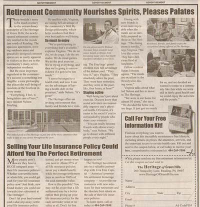
Compare the advertorial above to this one here and see the difference in the call-to-action. Click on the image to bring up a larger version.


Emphasize the benefits more – maybe in some bullet points!
It emphasizes too much about Buckley’s services and not enough about what Buckley’s can do for me.
weak call to action
I see a couple of improvements…
1. A testimonial would be helpful (space restrictions, I know)
2. Weblink and toll free number for FREE info access. There doesn’t seem to be a way to capture info, just a local phone # to call and people may be hesitant to talk to someone.
Mike,
There is no Offer with a clear call to action
I’d add specific before/after testimonials
An offer to create a lead, call to action.
The first thing I see is there is no offer.
If he would have put his website in the ad
with a offer to down load a pdf that describes
what these litter critters do and how to
prevent them from doing it. He could have
collected contact info and created a long term
relationship with prospects for future business.
There is no free offer like a report to get the prospect to provide their contact information so you can do follow up marketing and add their information to your database/herd.
There is no free offer as an incentive to take the next step like provide the prospects name, e-mail address or home address.
add a guarantee
Something that could easily be fixed in a few seconds to increase response would be a solid “call-to-action” like a free report or free guide.
The add would pull a better response if a free guide or special report was offered; sometning like – 5 Things Every Homewoner MUST Know Before Attempting Do-It-Yourself Pest Control or Doing Business With
Any Pest Control Company. This gets prospects to raise their hands, allows the company to build a contact list of new prospects and gives Drip Marketing Magic a chance to work.
Chester County pest control service warns …
Insects can affect the health of your Family
Critical Time for Home Inspections
Adding a sense of urgency to the call to action
Open with a story that speaks to the reader’s worst nightmares…then draw a lesson from it
FREE REPORT Available Now!
“How to Protect Your Family against these Harmful Pests”
No customer comment or testimonial and no Copydoodles.
There’s no call to action or offer.
Big Bold Gty and discount or deal to act now or b4 00/00/13, web site and testimonials.
There was no copy doodle or copy cosmetic in the marketing piece to make it stand out.
The headline reverse the font size? Critical…as sub-heading, smaller size. Add offer, a coupon/discount before call for action–and with a deadline. I might add a web site address in addition to just a phone number.
why not make an offer to get the phone ringing?
Lead Generation/ Lead Magnet combination. Better call to action such as Free Report (Lead Magnet) AND offer a 1 – 800 # (to involve them) such as ‘before you hire…call 1-800-xxx-xxxx and learn the 7 Biggest Mistakes”. Use different MEDIA/Modalities (audio, internet, Hard copy free report) of MESSAGE depending on who your target MARKET is (Media- Message – Market match).
Good article, however there is no strong call to action and no real benefit to call them. There is also a spelling error, minor but important (I’m an English Major)LOL
No strong all to action, “a reason why I should call right now and schedule an appointment”.
The headline is not strong enough. It needs to emphasize the problem – Spring insects eating you out of house and home? Why let insects take a big bite out of your pocketbook by having dinner on the house? Bring the point home with a photo of actual damage, and a free report with more graphic photos.
At the end of the ad, instead of saying “For more information or to make an appointment, it would be much stronger to say “To protect your home, so insects don’t move in and you have to move out… or
Insects are chomping at the bite, Spring into action and beat them to it. Call now for an appointment to get them to BUG OFF!.
Also, the ad had several errors in grammar and spelling. It needed to be proofread and corrected.
Needs a “Call to Action.” That will give the customer/prospect a reason to call to set up an appointment, and the business marketer an entree to discuss the offer.
There is no clear “Call to action” to get people moving quickly to call him.
No call to action.
No description of PAIN insects can cause homeowners and the remedy he offers.
No reason to call him over any one else.
How is he different.
What makes him the expert or authority.
a FREE offer would help, FREE CONSUMER REPORT
A strong RISK FREE guarantee.
The advertorial is “salesy”.
The image itself says it all: Buckley’s Pest Service is resolving the issue rather than showing an image that speaks for a pestless house or even putting one that shows a typical termite problem.
It feels like the sale is being pushed little by little from beneath the advert’s text.