What Mediocre Marketing Looks Like

It pains me when I see a local business owner miss the mark with their marketing efforts and create mediocre marketing that does little to get them closer to their business and financial goals.
If only they spent a few hours reading a few key marketing books and perused web sites like this one, they could dramatically improve their marketing and ultimately their bank account.
The example I want to share in this article is worthy of your time and input since it’s a very typical example of what many business owners consider “marketing.” Had this new business owner read my High Impact Marketing Manifesto, there’s a good chance they would have never made the mistakes they made.
The lessons I am going to share in this article and the follow-up article are instructional (and important) for EVERY business owner.
A few weeks back I noticed a local pizza shop, that had been around for years, was no longer in business. A new pizza shop opened in its location, which is off the beaten path and serves a large, affluent residential community.
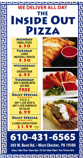
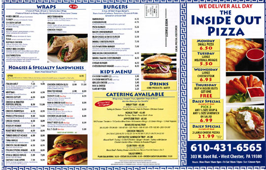
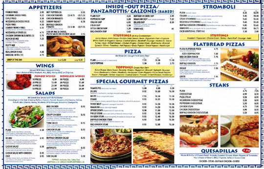
As I drove by, the name - Inside Out Pizza - caught my eye, however it wasn’t until I received the following Every Door Direct Mail™ piece did I think about it a second time (click to enlarge).
When I had a free moment, I read the piece with several expectations, which were quickly and disappointingly dashed. What I was expecting (and should have been sent) was not sent and in its place was a typical menu mailer.
Within a few seconds I identified three BIG missed opportunities with this mailer and several minor marketing mishaps and the reason I wanted to write this article and share this example was because the fundamentals behind the three big missed opportunities are useful reminders for all business owners.
Rather than sharing them right now, I want to make this an interactive, somewhat advanced, marketing contest.
I want everybody to put on their thinking cap, re-read the context I shared above and look at this piece and see if you can identify any of the three big mistakes that were made.
Since I am essentially asking you to read my mind <g>, I will give you these hints:
- The three big mistakes are not things like lack of testimonials, personalization or lack of CopyDoodles®, etc.
- The three big mistakes are at a higher, more strategic level and have more to do with the fact this is a new business in an established area.
- When the three mistakes are finally identified, you will see how they apply to your business. I will follow up this Thursday with part 2, which will include the three mistakes and my analysis of each.

In the meantime, the first five readers that identify any of the three big mistakes I want to focus on will win a free “Capuzzi Grab Box” full of fun, cool stuff I will send to you in the mail for free!
So take a few minutes, have some fun with this, and give it some serious consideration. This one is going to take some thought and insight, so leave them below and have a chance to win!


I’m going to go ahead and stick with the basics that are missing.
No real offer (would be nice to drive you to the website to get the offer and give your email address), no personal note from the new owners, no urgency.
1- No call to action or sense of urgency.
2- Competing on price, not by adding value.
3- nothing here that makes them stand out as different from every other pizza place around- doesn’t really talk about their product. In fact, they don’t even say what an ‘inside out’ pizza is or why a person might want one.
Hey Mike,
I see three things lacking:
1. A clear call to action. Nothing on this mailer says what to do next.
2. No scarcity or urgency (limited to first 10 or expires)
3. There’s no offer! No discount, freebie, etc.
They could have said something like:
Come or call in to The Inside Out Pizza and receive a FREE medium, 1-topping pizza with any order! Limited to first 10 to reply or 6/10/14, whichever comes first.
1. There is no clear offer.
2. There is no call to action.
3. It does not target or speak to an audience/group.
1. No call to action
2. No uniqueness ie. there is nothing to set this business apart from its competition
3. Clutter is all I see!
No map to show location since it is off the beaten track.
Too price minded for affluent neighborhood, should rather show how we are different and why people should WANT to come.
No call to action..
I like to interact with your marketing quizzes. I think the marketing piece should have made a reference to the previous established pizza parlor.
1. They could have said “special coupon for the customers of [previous pizza]” then they could borrow some credibility from previous business
2. They could have announced a grand opening event / farewell send off event for [previous business owner] where the community could say goodbye to owners and welcome new owners.
Those are my suggestions for capitalizing on the previous, established brand.
Here’s my thoughts:
1. Only two ways to respond (go in person, or phone — no email nor web address?) and no reason to phone (Reservations? Advance order to pick up later? Delivery? Are any of those offered?), but for some unexplained reason the phone number is given a huge footprint on the first section before unfolding it.
2. Generic item names. “French fries,” “hamburger,” and … “plain” salad? Even with features given in detail (in small, grayish-blue text) this doesn’t catch my attention nor sound special in any way.
3. No attempt seems to be made to capture the customer’s information, either. A free item for all new customers, or referred customers? An offer for a weekly raffle? Any reason at all to tell them who you are, if you ever make contact?
No headline showing differentiation and customer benefits.
No special offer introductory/new business/ etc
No call to action and benefit for doing so.
1. Don’t have anything unique – no USP
2. Maybe something connected with a fact, that there are new in that area so they try harder
3. They are very broad: from pizzas to steaks: it’s not the best positioning
An offer, a call to action, a big promise.
The name’s interesting but I’m not sure if it’s a new style of pizza or just a business name.
If it is a new style of pizza then they want to tell people more about it.
As they’re new in an established area I’d be putting out a coupon with an offer to try the pizza for free – and capturing their details in return. Very few people will only take the free pizza, the majority will buy extra items plus drinks too.
1. No unique selling proposition–why should I buy Inside Out Pizza over any of the other pizza’s in the area? This question is not answered. What makes them better? Unique? What is the benefit of an inside out pizza? Is it just a calzone? If so, calzones are pointless.
2. Lacks a strong offering–no incentive for me to buy with any sort of urgency.
3. I would have also made some sort of introductory offer, just to collect leads. Come in, give us your email or whatever, and we’ll give you some breadsticks–good for only the first week in business.
The first big one I would say is
1. Missing the story of what the inside out pizza is. The headline, though kind of generic made me think, what IS an inside out pizza? Then When you open it hoping to see some kind of story or what it is but instead all you see is a menu. LAME.
2. There is no “im new to the neighborhood so here is a gift for you” type offer or event. Especially if they are new to an established neighborhood a small block party or something along those lines would probably do well for them
3. Call to action, a menu is nice but why not respond by Friday the Xth and get free tickets to said block party or something along those lines.
Those are my thoughts!
I shouldn’t play golf on Mondays … it makes me miss my chance to win a box of cool stuff. I think the answers above are all excellent. No offer was my biggie. No map. No urgency. No voice. And I think that the one person who pointed out that it’s too price-focused for an upscale area made a very solid point. And it’s, indeed, a key strategic marketing decision.
Everyone has hit on some key marketing issues, but I would say one of the biggest is that they are using a Greek menu design for an Italian restaurant. If you don’t like Greek food chances are you wouldn’t even look at this menu. Second, there is no story behind the restaurant that would compel someone to want to order from them. Third, the photos on the front are clearly not appetizing for the majority of the women out there that decide and order dinner for the family – carbs, fried cheese, and meat.
Mike
Many of your readers have listed the most obvious. No clear offers though there are several daily deals and entire menu, no way to capture names, no reason to swing the door open, no USP, no map, etc. since you want something a little more advanced let me throw out the following ideas if I were to redesign this marketing piece.
1. Start with a very focused single concept. Forget that you offer everything from quesadillas to hoagies and wraps. Let’s just go with the inside out pizza and tell the story about how grandpa luigi invented this 53 years ago off the coast of Sicily. Then shortly after the war ended he immigrated to the US on the south side and for years he made this dish for his family and friends while he labored as a disheartened county worker. The owner loved his grandpa and as tribute to his hard work and courage making his life he decided to open this little shop.
2. There is no name for the shop unless it is the inside out pizza store. If that is it I would definitely rename the store to go with whatever story you want to tell about the origin. Luigis original Sicilian inside out pizza, tag line: 53 years in the making from grandpas secret recipe. Whatever the story is. That’s what you get paid for to figure it out. I’m only good for the concept
3. I would make a time specific offer to get people in with an irresistible offer, not a deal a day like they have. This could incorporate the list build with a grand opening contest. It could be a special that is so incredible that people just have to stop by to see what is going on. Free personal pan pizza on Tuesday and Wednesday from lungi’s old country recipe when you purchase a drink. Something so irresistible that people want to come in the door to see what the heck it’s all about. But the whole flyer needs to be focused on this one offer. Don’t confuse the audience with too many things. Next weeks flyer can talk about your grandma marguerite who came from Mexico and she made the best quesadillas. This week stick with one story and one offer and focus.
The first glaringly obvious thing to me was that they are tapping into an affluent residential market which means a couple things.
1. Increase your prices, maybe it’s just because I live in Connecticut which is expensive, but these seem like extremely low prices for the specials and even some of the menu items. You don’t need to compete as much on price if you’re in an affluent community.
2. Lead capture. It’s nice to mail to everyone, but failing to be able to follow up with people won’t help the business.
3. Offering delivery all day long seems kind of useless in an affluent community. Most of these people are going to be at work during the day, so they won’t be ordering delivery for lunch to their house.
Bonus – There’s no draw to try them out. They went completely generic with the marketing, so they won’t stand out against the already established restaurants in the area. Why would I want to try them out when I already have an established restaurant that I know, like and trust?
My first thought was, apart from being the new kid on the block, what makes this pizza shop unique or different from all the others in the area. Why should I switch from my favorite pie maker and give them a try? As you indicated Mike, it’s just plain vanilla to send out a menu…no matter how colorful the piece may be. They had the perfect opportunity to create a great first impression and tell their story…how they came to be, why they are passionate about providing the best damn pizza “inside and out” of the area, or a perhaps a personal message from the new owner with smiling a photo of him and his family.
Second, they could easily have included an irresistible offer (a coupon with an end date) to be redeemed at the shop or at the time of delivery. This could enable the collection of names, email addresses and phone numbers. Perhaps the incentive might be an additional special offer the customer can redeem on their NEXT visit. (encouraging multiple visits quickly, keeping the shop top of mind, and enabling more ways to follow-up).
Finally, my impression is, instead of focusing on one big idea that would grab the reader’s attention, they threw the kitchen sink at their prospect. I think the whole purpose of the initial mailing needed to be “what will get the prospect to call or come to the shop ASAP.
A minor point, no website listed. This is almost essential in today’s techno-iPhone, text message age.
I would say that besides the lack of a irresistible offer, and a lead capture incentive the biggest thing that I see that is missing is a way to track if the marketing piece actually brought in any business. The only way would be if they were using a special phone number which I doubt because they are missing most of the direct response marketing pieces that would make this a good ad. I don’t think they are smart enough to setup a phone number tracking system.
First off the creative doesn’t capture the essence or explain what the product is. They just mailed out a Chinese food “take out menu”, rather than using the mailer to explain their product and differentiate it from their competition and giving you the unique selling proposition.
Without “selling” or hyping up the the product/service, a coupon, website, or call to action would have little impact, as there is no unifying theme w/the piece and would simply get lost in the ‘noise’.