Find the fundamental flaw contest – a response form critique
I’m going to state from the very beginning the person, whose marketing materials I’m reviewing in this article, is a very smart and astute business owner and this particular marketing piece is almost perfect.
Almost…
And within that “almost” is a quick and important marketing reminder for anybody willing to invest 90 seconds and keep reading.
Yesterday, I received my monthly copy of Ron Sheetz’s newsletter in the mail. Ron publishes a fun, four-page “staying in touch” print newsletter for his clients which he sends out via First Class mail.
Based out of Cleveland, Ron is the owner of RJ Media Magic and helps business owners with video marketing and production for events and corporate videos. If you’ve been to any of Dan Kennedy’s recent seminars, you’ve seen Ron diligently working on Dan’s behalf.
I’ve watched as Ron has tweaked and improved his newsletter with each issue and the one I just received is certainly a great example of how to publish a terrific client newsletter. Just about everything is done right.
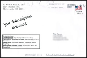
For example, Ron goes the extra mile and puts his newsletter in a 6 x 9 envelope, which protects the newsletter and gives Ron additional real estate to include teaser copy and CopyDoodles® on the outside.
His four-page newsletter includes a bunch of eye-catching graphics and photos which is always a smart thing to do and is written in a very personal, “me to you” tone. You can tell Ron enjoys sending this out every month. I scanned in the first page of his newsletter for you to see.
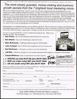
This month Ron also included a single-sheet, single-sided response form on ivory paper. An insert like this can be a smart strategy to help pay for the monthly hard costs of publishing a free newsletter such as this by offering a product for sale. However, Ron has made a few mistakes with this form, including one major fundamental flaw. DO YOU KNOW WHAT IT IS?
Here’s the entire form, which you can click on to see the larger version.
|
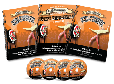
CONTEST ALERT! I have three great prizes I am giving away to the first three readers who spot the one fundamental flaw IN THE INSERT and what they would specifically do to correct it. First prize: A print version of my Copy Boosting Profit Secrets course, which we sell for $396.00.
Second prize: A signed copy of The Ultimate Sales Letter 4th edition book by Dan Kennedy (this is the edition where Dan asked me to write the chapter on copy cosmetics).
Third prize: A very fun and very cool CopyDoodles grab box full of goodies.
|
To submit your idea for the fundamental flow in Ron’s response form, simply leave a comment below. To be eligible you need to tell me what the flaw is AND what you would do to fix it.
Tomorrow, I will post my analysis of Ron’s response form, including what he did right (this will be a powerful lesson on designing response forms) and what he did wrong, including the one fundamental mistake he made.
Good luck and I look forward to seeing who can find the fundamental flaw!


Not sure if this is what you are looking for; On Ron Sheetz’s newsletter I don’t see a hard and fast deadline to the offer creating no sense of urgency to respond.
Thanks Kevin for your answer. I will keep you posted!
I would say there are no real benefits listed, just a vague description of each presenter. I’d like to see a guarantee for results.
There’s no way to order online!!!!! put a J box in there with a website address for immediate responders!!!!! This is, after all, 2012!!!!
There no info on who/where to call and/or a Web site if you have questions and/or want to pay with a live person and/or on the Web.
In today’s digital world, the first thing I always look for is an option for a digital copy. I only see physical options here, and for me, as a consumer, I would hesitate.
My recommendation is to offer a fourth option for a digital version, while also providing a website to see a more detailed descirption of the product (Good place to offer the opt-in for your list as well)
I do not see a specific call to action compelling someone to order. I think the respond by date of October 10th is too small and makes the bonus seem like an after-thought.
No way to follow up on those interested but not ready. Drive them to a capture page with free video clip from course then follow up with auto responders
1. Testimonials to leverage social proof.
2. Clearly defined Deadline.
3. Check Mark up top in the pre-headline before the “Yes Ron”
I think the fundamental flaw is that he used 2 different handwriting fonts and that each font had a different color.
I would have chosen one just one font and I also wouldn’t have put the two different handwritten messages so close to each other.
I think I’d eliminate ‘Risk Free’ and put ‘Guaranteed’ in red to make it stand out.
Needs more contact points (ways to order), and I think the “because I am ordering by Oct. 10” line needs to be larger and highlighted with appropriate CopyDoodles.
There’s no phone number.
I think the fundamental falw is that he is offering THREE options, which confuses the prospect! he should use only TWO options with a clearly defined advantage for the bundle so it becomes a no-brainer
It is one-sided. He wasted all the real estate on the back side.
I see other issues, but to me this is the most significant.
I’m guessing the flaw is as above, the mix of handwritten fonts. But for me, the biggest issue is “who are these people, why should I want to hear from them?”. It needs more on their results, inc. testimonials as already noted. Also agree with previous comments re: digital version, data capture and prominence of CTA/Bonus.
The two different style fonts make it look unprofessional and sloppy on the authors part. They should have just used one style/font
Use of the copy doodles fonts is confusing. It looks like it says “risk guaranteed!”
I couldn’t get the “guaranteed risk” part out of my head! I’d remove the “guaranteed” and just leave the “risk free.”
Mike,
I’m gonna say that there is no color on the insert, where as the newsletter is filled with color. The CopyDoodles aren’t fully being utilized in black & white.
Also, there should also be a way to order electronically (web or email).
I’d rectify these situations by adding the missing elements.
Offhand, video and audio are the same price.
DVDs have a higher perceived value and, therefore, he may want to adjust the DVDs higher.
This gives people a choice between “small, medium and large” (from a price point perspective).
With gratitude,
Charlie
No caption under the picture.
Too much copy to read thru to get to the point,
The initial Yes Ron….. misplaced.
no testimonials
The main issue I see is just offering a fax method to order. It should have every possible means, including phone, website, and a one-click Call-to-Action Button. He’s not making this easy and restricting response. I’d make it as easy to order as possible by having all options right there, big, bold, and plain as day. Isn’t fax the least used and hardest to accomplish?
Great comments everyone!
Keep ’em coming…
It’s already been said that the deadline needs to be bigger, and I think that’s really the biggest flaw! But the reason the deadline is so small is because he simply ran out of room… so the root of the problem is that he’s trying to make it a sales letter AND order form all in one page.
There’s a lot of time spent at the top of the form doing the selling – when there should be a separate salespage! I saw a previous comment that said that he wasted the real estate on the back of the flyer, and I think that’s spot-on!
Create a salesletter on the front of the form, expounding the virtues of the 7 different CDs/DVDs, and instruct them to turn it over to fill out the order form. Then he can remove all that copy at the top (which is too long and not interesting! What happened to bolding/underlining/italics in the paragraphs? I didn’t even read it all and I was really studying it!), highlight the deadline and the bonus (maybe even repeat the deadline at the very bottom of the form – always put that deadline on there twice!) and it would also help it flow a little better.
I don’t see a clear call to action!
I think not providing a way to sign-up online is the biggest omission. I am no longer comfortable with putting a credit card number on a piece of paper and faxing it or mailing it – I think it is less secure than a (properly secured) website. He also loses the ability to drive people to his website, even if they ultimately do not sign up.
To me, the summary of benefits and call to action is a little weak. While I can find them if I look around, they don’t really show me exactly what’s in it for me in just a few seconds. Also, the deadline is lost in all the copy. I just have to work to hard to find the benefits and then not very much sense of urgency is being created to get those benefits.
Tom
PS – Better than I could do and thanks for the lesson…
No strong call to action to order, no 800# to call to order, no online order capability. The order form area is boring in terms of font, size and too much to do. Also need the date to order for the bonus larger, using copy doodles arrows to stand out.
Mike there are a few things. The Free bonus for ordering by October 10th needs to stand out to be seen. No contact phone number. and I believe the 3 choices should be addressed to show better and best value. Another key point would be to have a couple testimonials to give these people some credibility.
I see more than one error in this marketing insert. The piece fails to tell the reader why they should care what these seven people have to say. Who are these guys anyway? What makes them experts?
The headline needs work. A teaser would be better; ask a question that the reader would want to know the answer to. An answer that they will discover in the materials being marketed.
Are there folks who have used these materials to their benefit? How about comments from satisfied users of the materials?
There is no immediacy in the piece. Assuming the first problem mentioned above is addressed so that the reader cares what these seven people have to say, there is nothing to prompt action NOW. Other than the promise of a “free” bonus if they acct by October 10, 2012, there is no call to action. The offer should be at this price for limited time only and fix deadline for action.
There is no indication of the duration of the guarantee. Can someone ask for their money back two years down the road? Is he reimbursing shipping costs or just the purchase price?
He didn’t give them a way to respond online, just fax or mail.
The envelope is NOT personalized with recipient’s name. Should say, “Mike – Your Subscription is Enclosed.”
1. Can order only by fax or snail mail. Need scan & email, plus online.
2. What does he mean by “Practice address?” For only doctors or dentists?
3. Doesn’t ask what kind of business they’re in.
4. Since he already knows you, couldn’t he have already completed the order form, save for the credit card info?
5. Free bonus/time limit doesn’t pop out.
6. DVD’s have “video only?” No sound on ’em? Bad wording.
7. First paragraph is long and wordy. Space is an issue, but more bullet points might be better. Even so, more CopyDoodles, underlining, CAPITALIZATION and italics would make key phrases emerge.
8. No “Quantity is limited” or “Only 37 left!” to create scarcity.
9. Check mark could be already inserted in the top left-hand corner.
10. There are a number grammar and punctuation things, but I won’t nit pick those. 🙂
Limited call to action options. Fax and Mail might decrease response. Could get a bump by adding a phone number and an email address or a website to order.
Looking at the form I don’t see a compelling headline that makes me want to read what the offer is all about.
Maybe something like
Are your sales suffering in this tight economy?
7 local businesses reveal their profit boosting secrets to grow sales, attract new clients and give your business an unfair sales advantage
Brenda, LOL! I did not even see that one! Not the fundamental flaw I am looking for, but a good subtle suggestion!
In YOUR copy, you underlined (signifies emphasis) that he included a single-sided response form. Only using a single side is a waste of valuable real estate.
Folks, keep the suggestions coming! I see three people got the fundamental flaw I was looking for and will reveal in an article I post tomorrow. Lots of great input here and hopefully a valuable learning lesson for all!
He is missing the web presence. He is requesting either to fax or mail only. I would think most would commit more so with a web opt in than taking the trouble to mail or if fax is even an option. Plus he could require the information he desired in an web opt form where the person ordering would be selective what information they give.
1) He should be highlighting the benefits or problems solved by implementing their secrets. Nothing stands out except the pricing. Too much copy at top. Should be easier ways to order as noted above.
HIS CONTACT INFORMATION SHOULD BE ON EVERY PAGE.
The bullet points are not intriguing- starting off with the speakers names which I don’t know and a telephone number should be listed which would make me feel more secured if I had any questions and there should be a way to order a digital version online as well.
The lines of text are too long horizontally. I would break it up into 2 columns and add bold subheadings.
I would say that I could not be bothered filling ot a form only to fax it. Why not provide an online access to order immediately. If they are hot from reading the material, make it easy for them to buy!
I would have printed it with color.That way you can make the stuff you want to stand out.Like the CopyDoodles!
WINNER #1! CONGRATULATIONS SCOTT! Check your email.
WINNER #2! CONGRATS ALYSON! Check your email.
WINNER #3! CONGRATS GEORGE! Check your email.
Not sure what a “Practice Address” or whose email address is supposed to be in the “Your Email” block. There is some confusing text and the small font makes it look like fine print and trying to hide the authority to use the applicant’s information. I do not see a clear CTA and there really should be a phone # and email address to reach RJ Media Magic. Hope this is enough.
Gary
the “flaw” of not having two sides is most likely due to it being something that is going to be faxed back to him. (the first request to send it back)
I have not send a fax in a long time via a machine but know that it is not easy to send a single page both sides via those crazy/old machines. This could very well be the reason why only one side is actually used.
Jonathan, but that doesn’t stop you from including testimonials or other sales copy or graphics that can help push more people to buy. Yes, you only have the order contact info on one side, but leaving the other side blank is a major marketing sin in my opinion.
So, Mike, thanks for another contest and as always your great marketing lessons. It is always refreshing to see and hear what others are doing in the way of putting CopyDoddles and great marketing methods you teach into use. Implementation is the key and you bring out the best in us…your protege’s.
Can you spill the beans in what was in your Grab Box of Goodies so we have things to aspire too?
John – Thanks! If I spill the beans… what fun is that? Let’s put it this way… its a very cool “box of goodies!”