Marketing Examples: What you should be doing in your business
I receive a lot of marketing examples on a daily basis in my mailbox and via email. Most marketing examples I receive are lacking in simple copy cosmetics and direct marketing techniques that would definitely improve response.
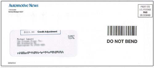
Recently one of the direct mail marketing examples< I received stood out beyond the rest of my mail and I thought an analysis of this piece would be useful to you. Let’s begin with this marketing examples envelope and why and how it got me to rip it open in the first place.
This marketing examples envelope is using two smart techniques for making sure I opened it.
The first technique is that I can see the “$233.00 Credit Adjustment” showing through the window. This even got me to stop and wonder why I would be receiving a “credit adjustment” from Automotive News. It gets me thinking I have money coming my way and there’s no way I am not going to open it to find out more.
The other technique is the use of a simulated bar code and DO NOT BEND note. This is designed to convey to the recipient that the contents of this envelope are important.
For those of you who do direct mail, start collecting marketing examples, because this example is a great study on the one of the primary jobs of an envelope, which is to get the recipient to open it.
Let’s move on into what was inside the envelope.
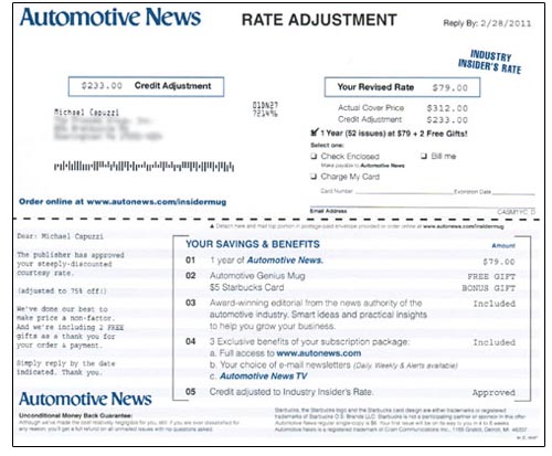
The first marketing example is the order form. Since they piqued my interest with the “credit adjustment” they continue the storyline and I now see that the “credit adjustment” is really a discount in disguise. It’s critically important that if you have some type of teaser on the outside of your envelope, you make sure the contents inside are congruent with the same message.
Personally, I like this credit adjustment grabber and think many folks looking at these marketing examples could figure out a way to do something similar.
Other important techniques illustrated in this marketing example:
– They’re making me an “Industry Insider” offer, which makes me feel special.
– They listed the out savings and benefits for easy reference and to attract any skimmers. They are also using their email newsletter as a bonus to the purchase.
– Dated call to action requires fast action (remember if there’s no deadline, there’s no offer).
– They’re offering an Unconditional Money Back Guarantee and I suggest you check out the copy… “Although we’ve made the cost relatively negligible for you, still if you are ever dissatisfied for any reason, you’ll get a full refund on all un-mailed issues with no questions asked.”
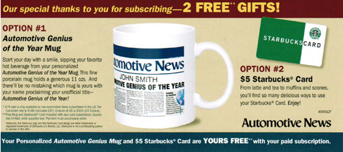
The other piece that was inside the envelope (besides the business reply envelope) was a “buck slip” that showed both bonus gifts I would receive, if I subscribed (smart strategy).
This piece is notable because:
– They’re offering not one, but two free gifts with an order.
– Personalized free offer that makes the reader feel good! The personalized mug will have YOUR name on it and it is made special for the customer. The note “Automotive Genius of the Year,” promotes the customer as a genius for purchasing a subscription
– Quantities are limited, so they create urgency to act fast before they run out
Of course the one thing they’re not doing is using CopyDoodles® for making certain parts of this marketing examples pieces stand out, but overall there are a number of smart strategies you can swipe for your next mailing!
If I’ve missed anything or you have any other suggestions on how to improve marketing examples pieces, leave a comment below!


Excellent example, Mike…. now I wonder how much better their response would have been with a handwritten copydoodle on there as well saying… “Open Before May 5, 2011” or some sort of deadline. Or perhaps a red stamp saying “Approved”… anyway something with CopyDoodles…
Do you think that would help or hurt the response on this piece? Since they were trying to get it to look “official” to get you to open it… would the handwritten doodles have interfered with that?
Hi Mike,
Great example. One improvement would be to have the actual recipients name on the mug on the buckslip. Worth a split test, anyway. I believe the response would be higher, but you’d have to determine if the additional cost would be worth it.
Tim, I agree. I think the addition of handwriting and CopyDoodles would definitely improve response!
Brian – excellent point. In this case, it may have been cost-prohibitive to personalize the buckslip and create a matched mailing. But I know I would have done this!
Is it true that you must not only get it opened, that you must meet the expectations of the recipient? If they feel mislead after opening will that not undo what the getting it open did?
Thom, you’re absolutely correct. Your message inside must be congruent with what’s on the outside, otherwise the recipient will feel mislead (and probably upset). I always preach about the importance of congruency.