Marketing Ideas: Smart marketing examples you should study! (Part 1)
Something must be going on in the automobile market, because in the last few days I’ve received two mailings that are definitely worth looking at for review, study, and to get some great marketing ideas for your own business.
Both examples follow the principles I outline in my “3 Steps to Incredible Response” webinar (and soon to be book). The mailings are personal, distinctive and they look “me to you.” These are three strategies I believe everybody reading this article should be using in their marketing campaigns.
One of the examples is very good and the other borders on excellent and both should give you some new marketing ideas for your own marketing campaigns.
Let’s look at the one that is almost perfect in its execution, staring with the envelope it arrived in, which you can also pull some great marketing ideas from.
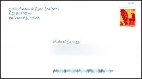
First off, this envelope is an “odd size.” It is 6.75 inches wide by 3.75 inches tall. Right off the bat, it stands out because of its unique, personal correspondence-sized format.
Combine that with a blue handwritten font and a return address and sender names and this envelope begs to be open.
I had no idea who Chris and Ryan were, but their address is local and this has all the indications of a personal piece of mail, which is great to pull some marketing ideas from because everyone is more likely to open something looking like personal mail.
Could they have done better by using a non-pre-sorted, first-class stamp? Probably. But the presorted first-class stamp is a decent alternative.
The marketing ideas you can pull from this envelope are…
• personal (addressed directly to me)
• distinctive (unique size and stamp)
• and has a “me to you” look (handwritten address and return info in blue)
Whoever put this together did a great job and they continued the smart marketing strategies inside where you can pull even more marketing ideas from…
The first thing that sticks out, and you should mark down with your other marketing ideas, is the personal-looking correspondence format of the letter. This piece has the look and feel of a personal letter being sent directly from Chris and Ryan using their own personal letterhead that is 6 inches wide and 9 inches long.
If you’ve ever pulled marketing ideas from very old letters, back in the day when people use to write letters (instead of texting, email, etc.), this personal letterhead format was used quite often. It is a very distinctive look that stands out from everything else in your mail and ironically is one I recently started using myself as you will see below in another example you can get great marketing ideas from.
One of the marketing ideas I’m pulling from this example is that I like the personal feel of the “From the desks of…” headline.
Then, using the same blue handwritten font, they write me a letter about my wife’s minivan. They know the exact model and year of the van and they use that data smartly.
• Letter is personal to me – smart.
• They have a August 31 deadline – smart.
• They use a P.S. – smart.
• And I especially like the circle CopyDoodle that calls attention to the call-to-action – very smart.
Overall, an excellent job (and if we still owned the van would inspire me to call).
The one area I could see improvement would be multiple ways to respond (call, email or fax) and I would have stressed the idea of contacting Chris or Ryan directly, instead of going into some generic call center. This call-to-action would have been more congruent with the feel of the piece.
Again, the marketing ideas you can pull from this mailing are:
– personal (uses my name, car model, etc.)
– distinctive (personal letterhead size)
– and has a “me to you” look (blue handwriting, CopyDoodle)
The format of this mailing is very smart and can be very effective, so make sure to save all of the marketing ideas you’re pulling from it!
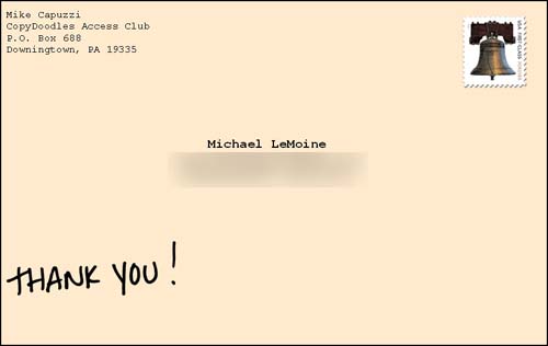
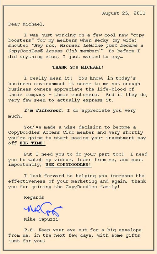
Just yesterday I had a consulting day with a successful info-marketer who was putting together a direct mail campaign for an upcoming event. I suggested this same exact format and marketing ideas to help her break through the clutter and get opened and as I mentioned, I recently started using this format myself and sending out a personal note to new CopyDoodles Access Club members.
Next week, I will share the other notable mailer I received from another local car dealer, which is also great for pulling more marketing ideas from. It’s pretty neat.
I would love to hear your thoughts about this particular marketing example and marketing ideas how you’ve used other similar personalized marketing styles in your marketing. So leave a comment below before next week’s post (9/1) and in return, I will email you a PDF that contains the full-sized images of both marketing pieces above so you can print them out and swipe all the marketing ideas you need!


I really like the idea of colored stationary – not white – and of course the handwritten aspect invites the receiver to read it through.
Great examples, and good reminders!
Hi Michael,
Thank you very much for the ideas! I’m going to start using them in my direct mail campaign right away. I have a Chiropractic center and this will be great to use when communicating to patients.
Thanks again,
Dr. Brian Coyle
Mike , I know according to GKC marketing is marketing . When I use direct mail for an injured car accident victim offering a free ethical bribe to contact me don ‘ t you think that should appear as professional as possible . I still incorporate deadline & ps Do you have any thing to offer that fits that bill or do you disagree ? I ‘ m fearful to even run a test that my letter winds up in the hands of a disciplinary committee who misconstrues my efforts to help , & market within the rules
Great Stuff! Love how you nurture your customer with great content.
Thank You!
Brad
Hey Mike, long time no talk.
The letter from Fred Beans (Chris and Ryan), that marketing was most likely done (unless someone in the dealership itself did it, which I highly doubt) by Stream Companies. They handle all of the marketing for Fred Beans. In fact, I’m pretty sure Fred owns Stream Companies.
They are located in Malvern.
Take care, Mike. Hope all is well with you.
-Gene
Thanks for the tip Gene! I’ll have to check out some of their other marketing.
Paul, a bit more of an in-depth question than I can answer here, but why wouldn’t a more personal, “contacting you to see if you’re OK’ type approach work???
Gene is correct about Stream Companies. There is a testimonial from Fred on Stream Companies website. Click on cleint tap to view
Mike,
I love your stuff. I’m in sales and part of my sales campaign is direct mailing. I use stamps rather than metered mail. I also started using a font on my envelops that looks more like it was hand written. i can’t wait to get your book!!!!!
dO YOU HAVE AN EXAMPLE OF a letter a dealership might use directed to a list of fresh BK filings? This seems like it would work great.
Wow! Great tips. I am just getting started in Direct mail and can see the immediate value.
Thanks!
Hi Paul and Mike,
This puts me in mind of an example from Bill’s book – Outrageous Advertising – pg 38. It’s from a company called Megafast. The owner created a superhero and appears at conferences in full costume.
Here’s Daryn’s explanation for why he stands out in an industry of 3,000+ suppliers: “No other supplier in our industry would even dare pull a stunt like this…they’re all too professional.”
Paul, try just changing your letter into a handwritten font. Keep all the same copy, and warm it up with the font.
When response rate goes up, move on to try Mike’s suggestion of a “Are you OK?” approach with a handwritten font. Maybe taking it in smaller steps helps expand your comfort zone, too.
Hi Mike,
Yes, I agree completely.
SendOutCards gives some of this approach. I use them for Thank You cards and minor follow up.
The handwriting font also gets used in a package mailing. It’s for the Read Me First letter, which is from me to the recipient. Who has also received a SendOutCards card telling them the package is coming in a cherry envelope.
I’ve been toying with the idea of including a couple of handwritten sticky notes on the book and CD in the package. After reading your post, I’m going ahead and trying it.
Thanks Mike.
Thanks Conrad! Keep me posted.
Hi James. Not sure what type of letter that is.
Do you find these tips applicable when mailing to executives in corporations as well? Or would they perceive the handwritten fonts, irregular paper size and copydoodles to be unprofessional?
Lexi, if the intent is to connect with another human (executive or not), why would you consider a handwritten note “unprofessional?” Quite the contrary in my opinion. Thanks!