High impact marketing no-no: a personalized postcard example
In my last article, I showed an attempt of high impact marketing that goes wrong by trying to personalize in a way I consider deceitful and simply wrong (you can read it here). While high impact marketing is all about personalized marketing, it’s about doing it in an authentic, integrity-based, friend-to-friend way.
The example I am about to show you is a better (not by much) attempt at personalized marketing, but it still falls way short of creating a truly personalized marketing experience. It has several major mistakes. Can you find them?
As a matter of fact, I’m going to turn this postcard autopsy into a contest where I will award a book gift to two random winners. I will also post a second part of this article next week, where I do a quick makeover based on the suggestions received.
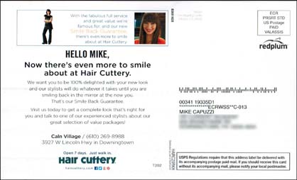
So here’s the postcard I received in the mail from a local, franchise-based hair salon (you can click on the images to see a bigger version). Let’s take a look at the “back side” first (not sure if there is a technical front side and back side to a postcard, but I call the side with the mailing address the “back side”).
O.K., so my eyes fall naturally to seeing my own name in print (first to ensure it’s indeed for me and second on the left hand side with the “Hello Mike” text).
Do not scoff at this simplistic form of personalization. Even today, seeing your own name in print is a powerful eye-magnet and should be used as a minimum in all high impact marketing campaigns. Simple “mail merge” personalization like this can be done by any business owner, in-house or with a printer-partner.
After this minimal attempt at personalization, the rest of this side of the postcard is pretty much wasted.
I jotted down at least six things that could be instantly done to improve the personalized experience of this side. How about you?
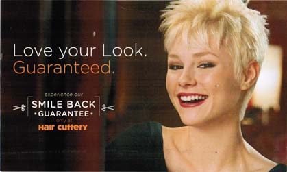
Let’s flip it over and take a look at the “front side.” Hmmm… see anything blatantly wrong with this attempt at sending me a personalized postcard?
Again, I jotted down several ways to quickly and easily improve this side. How many do you have so far?
The only defense I can offer is that RedPlum (the company that printed and mailed these for their client) has limited personalization capabilities. I am sure they printed these postcards up generically by the tens of thousands and then did the text personalization in a second printing run. Typical of big dumb marketing.
Imagine if they designed this piece with the suggestions readers are going to offer below. Think the results could be a tad bit better?
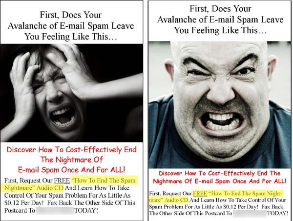
Just to show off my marketing genius (ahem), here is a simple postcard I created years ago for a client’s multi-step direct mail campaign. It’s clearly a better attempt at creating a personalized experience (female recipients received the card on the left and males got the card on the right), wouldn’t you say? Yes, it required a bit more work to segment the mailing database based on gender, but not a major deal.

Remember this example from 2012? A bit extreme, but it shows you what technology can do for the marketer. https://mikecapuzzi.com/brilliant-marketing. This is what high impact marketing is all about. Creating a personalized, 1:1 experience for the recipient, so that when they get it, it makes them feel as if the sender sent it just to them. With today’s technology and software tools, you can create hyper-personalized marketing that stands out.
CONTEST TIME! What improvements would you make to improve the personalized experience of this postcard? Leave your suggestions below and we will pick two random winners from all the comments and send them a free copy of “Jumpstart Your Creativity” by Steven Rowell and Shawn Doyle. Good luck!


Whelp, the front and back of the postcard has a picture of a woman and they’re trying to market to a man. Now, if this was a strip club it would probably work. Ha.
The whole postcard is geared towards women.
Also, I personally like to circle the receipent’s Mailing address.
And.. Where’s the CopyDoodles?!
First thing, I would but the box at the top that talks about the company at the bottom. The back should start with “Hello Mike” and the rest of the message.
Just like David, I thought that their should be at least one graphic of a man. Maybe a Photo of a woman, man and a child.
Also, the message implies or assumes that you have a reason to smile about their company and this card is going to give you more to smile about. Is this for lead generation or customer retention?
And yes, CopyDoodles would be nice.
I forgot to mention. The front has zero personalizing.
OK, the front first:
1. No call to action
2. No live stamp, instead a generic mass produced pre-paid stamp, You are just another number in the masses
3. No special offer or reason to even visit them
4. No testimonial
5. No hours on the post card, open 7 days but walk in when?
6. No USP
7. Not gender segmented
8. Bland colors, expcept for two pictures, everything else is black and white
9. USPS warning at the bottom is very distracting, besides, who is going to complain anyway, they will just throw it away
10. Waste of paper real estate
Back:
1. Not gender segmente again
2. Back ground color too dark
3. Revers print harder to see
4. Nothing compleling about the photo
5. No more information provided
6. Big waste of money all around
The ‘smile back’ concept is good in principle, but execution is terrible. If the visual showed a customer sat in a salon chair smiling at his face in the mirror, the idea would come to life. It’s more of a female concept, so even with a male pic I’m not sure a typical guy would aspire to this…but it’s certainly not going to work if you use the wrong gender pic!
Oh yeah, and to echo David…bring on the doodles!
Hello, here’s my opinion on what’s wrong with this marketing piece. For one thing, it is geared towards women by the photos, something which you are clearly not! They should have had 2 versions of the mailer- one with a photo of a lady for women, and one with a photo of photo of a man for men. The smile back guarantee is confusing- what the heck is a smile back guarantee? Do you get your money back if you hate your new look, or do you just get a blank stare and a smile back.Of course they explain later what a smile back guarantee is, but by that stage the reader has long gone, and left skid mar. They ain’t gonna stick around trying to figure out what the heck your long winded confusing guarantee is trying to say. No offence.There is no benefit driven headline and also they say their headline, and also they say their OWN name in the headline, which nobody cares about, people reading it only want to know what’s in it for them, so they should have a benefit driven headline, and then put their own name further down the page. Also when they say just walk in, as in no appointment needed, it makes you think that the joint must be so empty to not need an appointment, that it must be pretty bad. No scarcity, they are almost telling the world they have no customers. Some kind of coupon on the postcard would also be nice. That is my two cents worth. Thank you 🙂
Where do I start? First off the wasted real estate at the top of the address side… what the frick is a ‘”smile back guarantee”. I love a good guarantee but that does not even make sense. Already causing a disconnect. Just seeing the pics of the girls in the guarantee makes me feel it is not for ‘Mike”. The awful center justifying of the text makes my head hurt. The vanity headline “Now there is even more to smile about at hair cuttery” that surely would not create interest. I’m not sure if you are a customer of theirs so I do not get an entire card pushing a limp guarantee. They would be FAR better off ANNOUNCING their new mens packages. The piece has no direct response mechanism at all. What are they expecting from the piece? As for the other side of the card…it is almost criminal this campaign is not segregated male from female. NO man would likely read a pathetic word on this card if they saw the front first. Mike, this may be one of the biggest fails I have ever seen. It missed on EVERY basic principle. They flushed their money and will never even know about it as there is no response tracker at all.. I need a nap
Not quibbling with many of the comments above, just amplifying Mike pointing out this is Valassis.
It’s a ride along detached card, it’s the address card that rides along with their shared mail package.
There’s no option for live postage, or changing the way the address is ink jetted. These go out under $300/M, they’d double the cost if they customized the front.
Not to say this couldn’t be improved in many ways outside of the personalization components.
It’s a valid exercise to ask what you would do if you were out to create a fully customized, segmented piece. That’s not an option with this product as-is.
Jim – nice to hear from you! Thanks for pointing this out and it’s an interesting marketing discussion. What’s worth more, a small, more hand-crafted campaign (which may have a higher cost per piece mailed) vs. a cheaper, mass-produced mailing like this??? None of us will know with this particular campaign, but we can hypothesize.
Mike –
Full agreement with the comments already posted. My add-in would be to invite them to a landing page for a coupon, or something free (eg. “Top 5 Thing to Ask Your Hair Stylist…”). The end goal, of course, is to take the relationship further, gaining an e-mail address and, with it, another marketing avenue that can be developed into a more personal approach (PURLs, videos, newsletters, etc.)
First, why don’t they match up the fonts between ‘Hello Mike’ and the headline below. That’s always a pet peeve of mine. Second, obviously putting women on front and back when it’s being sent to a man was a mistake.
Next, they brag about great value, but don’t offer an example. Or make an offer. Except to “do what it takes” to get a good haircut. Are they that weak it takes that much effort?
And they talk about themselves, not the prospective customer. What the heck’s a “Smile Back Guarantee?” A bad attempt to be clever, I’d say. Where are the benefits???
The haircut of the woman on the front side awful, at least to my eye. And isn’t that particular style dead and gone? I don’t know, I’ll admit.
My path from my roadside mailbox into my house goes right by the recycle bin. This piece would have found itself in the bin. Why?
1) Addressed to a male, female picture….if you can’t personalize the image, then go with one that would appeal to everyone…a family or individual shots of a woman, man and kids…would be better..or a male before/after pic and a female before/after pic
2) I see no offer…how about a coupon or special first time client offer?
3) Call to action is to smile? I would expect a call to action that is Come In or Call for an appointment
4) The “guarantee” is empty and not very compelling. I could leave smiling because they have done everything they could to satisfy me and I’m just happy to get out of there without them resorting to shaving my head!
5) I’m a guy, my wife and daughters do not complain about the way my hair looks, I have a barber who is conveniently located, I know the hours she is open and I don’t have a need to have my hair “styled”. So, they need to put their hours on it and provide me a reason to take some action.
6) There is no tracking mechanism…..they need to know that the client is responding to this piece so they can measure the effectiveness of their spend.
Mike, maybe it wasn’t wrong. It did say “Love Your Look.” And gosh, you’d look FABULOUS as a woman! 🙂 Where’s the offer? Where’s the Copy Doodles? It would be great if it new you were a new/returning customer and then offered a personalized experience to get a new look with a stylist selected just for you.
As an inveterate skimmer, the first impression I got from the front of the card was – Orthodontist or perhaps makeover artist.It can be anything to do with hair because the hairstyle is cropped at the top; its definitely teeth. Bin.
The second side is more disjointed. The top box is off balance and populated by two strange women, so its obviously not intended to appeal to men. The text is nonsense.
First off why is the Hair Cuttery SHOUTING AT ME? All Caps is a no-no.
Also no offer, no deadline, no ‘bring this card in with you and enter our free draw, get a discount’, whatever.
No compelling copy, no USP, no urgency, no telephone number or other contact detials apart from Social Media, if I did want to book ( I hate walk-ins as my time is very precious; I cant afford to hang around in line. Where is the CTA?
Shambolic meaningless guarantee; if I’m not happy do I get my smile back?
I also agree with the comments posted.
1) There is no tracking mechanism and no way to measure the ROI for this specific campaign. This metric is very important and helps them decide if they want to run it again.
2) There is no direct response strategy. A multi-step marketing strategy is a must to get peoples’ information. Not everyone is ready to get a hair cut when they received the mailing piece.
3) There is not an irresistible offer. Claude Hopkins said: “The right offer should be so attractive, only a lunatic would say no.”
4) The Headline is very weak. O strong headline is needed to get prospects to read the rest of the copy.
David Ogilvy said: “When you have written your headline, you have spent eighty cents out of your advertising dollar.”
5) The “smiling theme” is the wrong theme. As James McRoy stated above: “the first impression I got from the front of the card was – Orthodontist or perhaps makeover artist”. The “smiling theme” is usually associated with dentists and orthodontics.
6) The copy is also weak, it does not convey a strong value proposition. Most businesses use the Who, What, When, Where information on their advertising, when the only question on the mind of the prospect is WHY? Why should a prospect go to the Hair Cuttery?
7) There is not an emotionally compelling message that resonates with your ideal prospect. Human beings buy based on emotion. They only use logic to justify their purchase.
8) Copy cosmetic is really bland (different fonts, centered text, reverse text, etc..). Copy Doodles would surely improve this mailing piece.
9) The box on the top with the Smile Back Guarantee should be removed completely and the saved space should be used to ad more benefits for the prospect.
10) The name personalization is a good start, but they could have also added more personalization such as a map with the marked line from the prospects address to the Hair Cuttery. And they should say something like this: ” We are conveniently located only 1 mile from your home”.
11) There is no gender segmentation. Let’s say there is a 50/50 divide of prospects who receive this mailing piece. The men would immediately throw it in the recycle bin. This means that half of the number of the mailings were wasted.
12) Weak call to action: “Visit us today…”
13) No urgency/scarcity strategy.
14) And the last, but not the least: The mailing piece design screams: “This is advertising”. People hate advertising, they think it is manipulative and deceitful. I think that ads should be more me-to-you kind of approach, friend-to-friend, conversational style.
Very nice checklist Petru!