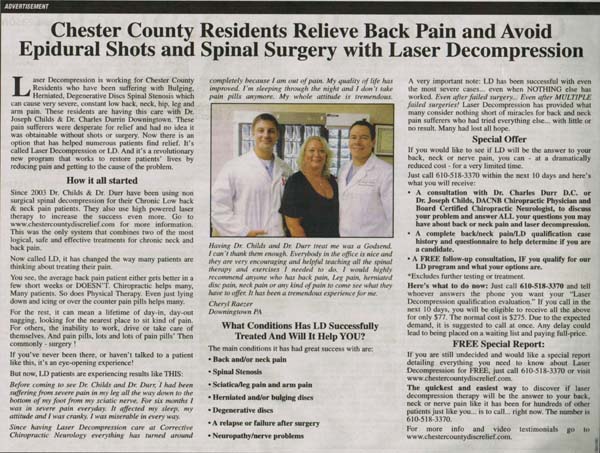
A good bricks and mortar direct response advertisement
I love it when I see local bricks and mortar business owners create extraordinary marketing and the example I want to share with you here, is a very good one – worthy of your study.
(On a side note, creating great marketing is what I help my High Impact Marketing Members do each month, via my High Impact Marketing Report newsletter and High Impact Marketing Superhero interviews. Click here to get a trial issue).
This direct response advertisement comes from two local chiropractors who I don’t know personally, but whose marketing I have seen for years (and a number of their pieces have a permanent place in my swipe files).
This ad was run in my local newspaper and as soon as I saw it, I clipped it out to share with you.
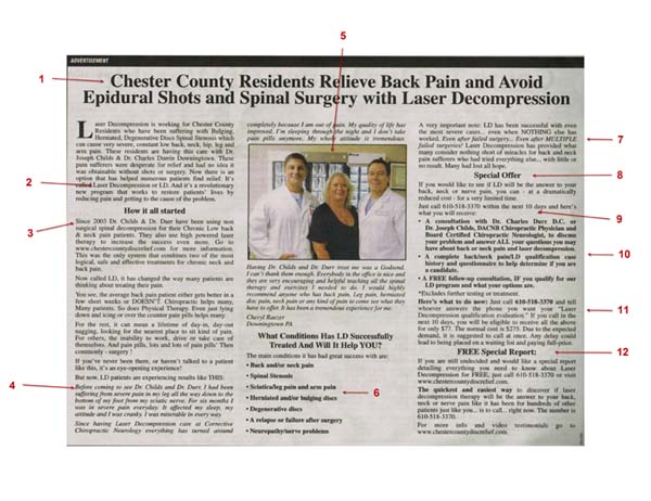
There are at least 14 smart things these doctors are doing in this direct response advertisement and if you click on the image below, you can see my notes relative to these various points, which I thought would be beneficial to give you (click on the image below to enlarge).
1 – The headline is “personalized” and speaks to a very specific person, with a specific need.
2 – The ad is wrapped around a “big idea” that appears new and different.
3 – The ad contains a short “back story” to help introduce the docs to folks who don’t know them.
4 – A powerful testimonial from a local patient.
5 – Excellent use of a photo with the patient. Makes the testimonial even more real. I’ve been harping on the use of photos in your marketing. This article gives some tips: https://mikecapuzzi.com/3-high-impact-marketing-ways-show-customers/
6 – Nice use of bullets to articulate benefits in an easy-to-read way.
7 – Addressing the “elephant in the room.” Many people may be thinking this new solution cannot help them, but the doctors address this way of thinking right in the ad.
8 – What’s a good direct response advertisement without a special offer? They have one and it’s a good one.
9 – They tell the read exactly what to do and give a deadline. An offer without a deadline is a weak offer.
10 – A strong, irresistible offer is critical to motivate people these days. This is a good one for the target audience.
11 – They reiterate what to do next and illustrate the value of taking action now (saving money).
12 – That have a secondary offer (almost like a downsell) for people who are not ready for the special offer to get a free report. So this way they are capturing two different types of leads. People who are in serious pain and need help now and people who are in “investigation mode.”
13 – Overall this direct response advertisement is an excellent example of good copy cosmetics. The use of boldfacing, columns, a drop cap, different fonts, a photo, subheads, bullet list, etc. all help make this ad legible and easy-to-read.
14 – Personally, I like the personal tone and feel of this ad. It is definitely not the typical chiropractor ad you see in glossy magazines and ads. These doctors get high impact marketing and this direct response advertisement shows it.
What Do You Think?
Is this a good ad in your opinion?
Are they missing anything? Is there something you think could be improved? If so, leave your comments below. I would love to hear from you!


Michael,
This is another way how you differentiate yourself from every other “expert”. This kind of thoughtful analysis is invaluable to people like myself. You are nothing like the other so-called experts or gurus out there. It is like the slogan from the local pizza shop. “You have tried the rest, now try the best”
Thank you Michael
Adam – appreciate the note and the fact you appreciate what I do.
I really like your article Mike and I believe strongly in direct response marketing/advertising. You have shown what a strong direct response ad should contain. As a publisher for over twenty years, and prior a career in directory advertising, I truly understand. Now as the internet has been redefining itself over and over we now know that it’s misunderstood. Social media marketing is not a consistent way for small business to market their services. Now we better understand after years that advertising in social media has destroyed so many small businesses. So the interesting question is – why do so many new businesses believe they must advertise on the Web? We know to Tweet, Facebook, Bing, Pintrest, Google this well done ad can’t work, consumers just couldn’t deal with this. So the consumers decision making process leaves it up to a recommendation, or review, that basically says for no other reason trust what I say you’ll be very satisfied with this business. I could go on. Mike keep making your point, you’re right on target.
Thanks for the note Sal!
Hey Mike,
Great article critique and observations. Also, giving credit where due. And for us, your students, keeping us on our toes. Much appreciated …
In my humble opinion here’s what I’ve got …
Testimonial
S1 how long did it take for her to heal – from beginning to end (from to, #weeks). In addition, where are the before and after pictures?
S2 everything after “I would highly recommend …” delete. something like: “I highly recommend Laser Decompression to anyone suffering from pain.” would do just fine … and concisely.
Call to action
S3 “… tell whoever answers the phone …”? NO! Call [name of person(s)] at 610-518-3370 …
The testimonial says “Everybody in the office is nice and … encouraging and helpful …” Remember? This is an opporunity to put a face (well, voice) on them people …
S4 you may be sceptical, wondering whether Laser Decompression will work for you. that’s why I’ve a FREE report especially for you. Call 610-518-3370 or visit [website] for more details. It is not a question of “If you are still undecided …” They may have tried several things already …
Could be nice to have
S5 testimonial in quotes – maybe
S6 Downingtown, PA just above the first paragraph
PS S stands for suggestion i.e. S1 = Suggestion 1
Looks like a very effective ad – what were the results?
Mike: Thanks for this great SWIPE and for a great analysis.
It reminds me of the David Oglvy piece on creating ads that sell.
This ad might be improved with a pre head that identifies the prospect and an even better headline (but this one is great).
It might also benefit from the numbered list approach seen in the Oglvy ad. But it’s strong! Is it converting really well? I’d test it as the control against a slightly different version ala the attached… (which we happen to be testing right now).
http://www.paestateplanners.com/library/david-ogilvy-how-to-create-advertising-that-sells-copy.pdf
Kathy – I am not sure. I don’t know these guys personally.
Hey Dave – thanks for the note and Ogilvy piece. Useful stuff!