High Impact Marketing Quiz – Google Mailer
One smart way to create high impact marketing is to not make the same mistakes others make, and you have to look no further than your mailbox for lesson after lesson on how not to market your business.
If you’ve read my articles for any length of time, you know I like to run high impact marketing contests to see if my readers can spot the mistakes and fatal flaws in marketing pieces that come across my desk.
It’s been awhile since my last contest – so to see if anybody is reading and more importantly able to find the mistake I want to point out, I have two brand new books to give away today.
The classic book by Robert Ringer – To Be Or Not To Be Intimated? That is the Question.
And No B.S. Business Success by Dan S. Kennedy.
Recently a multi-panel self-mailer (7” x 5.25”) was sent to me by Google and there’s a high probability you have received similar offers from Google giving you a credit to try out AdWords.
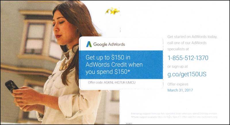
Besides noticing the important lesson of an “online” company doing good, old paper-and-ink direct mail to generate sales, the ad agency, who I am sure put this together, made a fundamental mistake, that if corrected, would generate a better overall response.
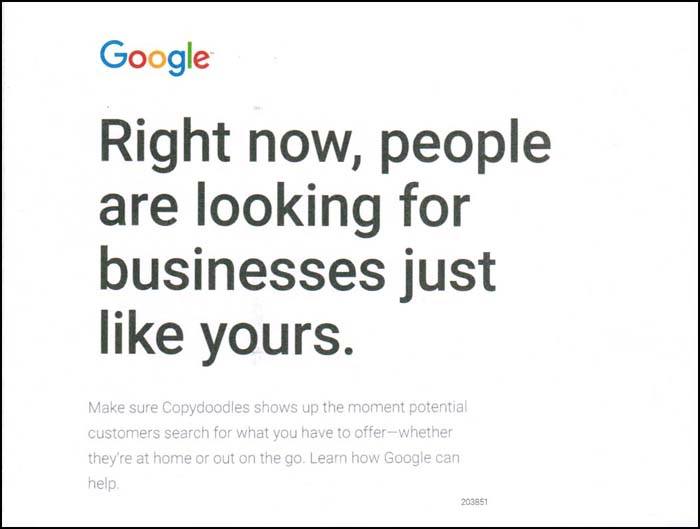
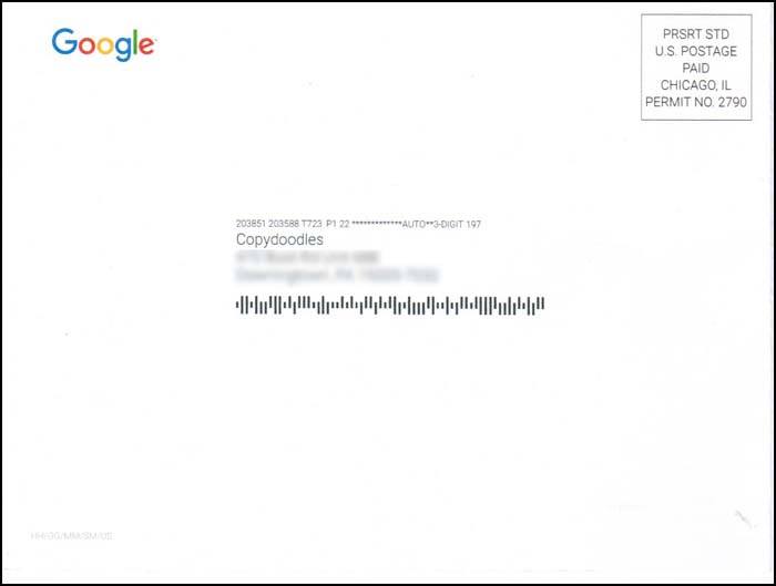
There is a second, obvious mistake in my opinion, but it’s not the BIG one I want to see if you can identify.
Regarding the BIG mistake, I will give this little hint. The person putting this together attempted to do the right thing, but missed the mark.
By the way, the mistake has nothing to do with the fact that they are sending this to “Copydoodles” instead of a specific person.
I will randomly pick two winners who identify the high impact marketing mistake being made and update this article with my comments and announce the winners.
Put your answer(s) in the comments section below and good luck!

HIGH IMPACT MARKETING QUIZ UPDATE!
There were lots of excellent marketing critique feedback about this piece, including:
Elsie, Bernie, Kevin and Jim who correctly pointed out the copy is weak and there are no big benefits or outcomes articulated.
Roy who pointed out there is no risk-reversal.
Neil who brought up an interesting technique with the use of photos and how to use them.
Mike who suggested there should be more copy and/or graphic enhancements to the ADDRESS panel of this mailer. Big wasted opportunity here.
Peter who has a very good suggested tweak to the headline.
However, it was Tom who got the answer I was looking for and the point I want to make (Tom reach out to me regarding your choice of book).

Whoever designed this realized that personalizing it would help with getting it read, however the BIG, BIG mistake is that they buried the only point of personalization in small body copy, when in fact, it should have been in the headline – BIG AND BOLD!
If you are going to go through the expense of adding personalization, then make sure it’s featured and doing everything it should be doing to get the reader’s attention.
Burying it, like they did in this piece, is like going through the effort of making a big, homemade dinner and then putting it in the fridge and serving a T.V. dinner (do they still make those?).
Without too much thought, here is how I would have designed the two panels that contain personalized content.
On the ADDRESS panel, I would have added some additional personalization with a handwritten font note. Like this:
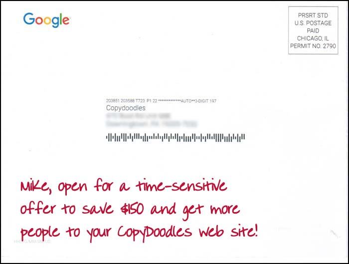
On the inside panel, I would remove the Google logo and put in the recipient’s first name and their business name in the headline. I also added a CopyDoodle in bright red to help draw my eye into the piece.
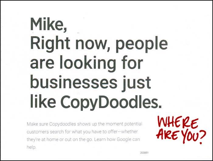
Definitely, better and more attention grabbing! The big takeaway here is that personalization and customization is a smart and effective strategy – WHEN DONE RIGHT. Here are a few past articles on the topic of personalization you might find interesting.
https://mikecapuzzi.com/how-not-to-create-personalized-marketing/
https://mikecapuzzi.com/high-impact-marketing-no-no-personalized-postcard-example/

The big mistake I see, or think I see, is that they are going for a phone call to sign up right away. Instead of some or in addition to some lower resistance offer like some kind of giveaway to show why they should use google adwords, or how google adwords can boost their business. Get interested people see how awesome their results could be then hit them with a call our rep or set an appointment kind of thing.
The second problem I see on the envelope piece is the lack of a physical stamp. They used some automated thing to write out the address and affix the label. Even if it went to copydoodles it would have had a better impact if it was at least a handwritten font and an actual stamp (preferably at a slight angle). Anyway, those are my thoughts!
The card doesn’t really tell me what the use of adwords will do for my business. It just says my business will pop up when someone is looking for a business like mine.
The copy below the headline fails to translate that more traffic to your website means more money for you. Also, a testimonial or a case study couldn’t hurt this piece.
No benefit driven headline.
Fundamentally, I think the copy lacks sufficient risk reversal power. It requires an output of $150 to use the service, which may be very unfamiliar and offers only a credit, which doesn’t give the money back if the campaign doesn’t work. Would be better to offer something FREE to try it with a little less money like Free $35 dollar coupon to try with incentive of matched credit for certain amount of money spent beyond that amount.
Also, would have been good to prompt action with a short sentence of statistics of what average adword campaign ROI is. I’m sure google has that information. It could be a prompter for a CTA.
Thanks for the quiz….certainly helped me to attempt to apply the things I’m learning about copywriting.
Agree with Elsie and Bernie’s point…the copy doesn’t clearly communicate the key potential benefit to the business owner from using AdWords…getting more customers (cost effectively) and ultimately making more sales (and money).
Eric makes good points. Who wants to ring up to talk with a salesperson? Yikes! This is the old Gary Halbert point of reassuring people that if they call a number they won’t end up having to fend off a salesperson.
Overall, it seems to me that they haven’t really thought through the sales process very well.
Interesting that the copy makes a point about showing up on mobile devices. I know that more than 50% of internet traffic is now on mobile so this is important. Not sure that issue would be top-of-mind for prospects at the initial stage.
Thanks Mike for an interesting case to look at!
Hi Mike,
I’ll go a little different direction than the other responses…
Considering you’re a visual marketer, and based on your hint, I’m going to go with a mistake in the graphic design of the piece.
What they did right was use an image of an attractive (but not too attractive) woman in the layout.
Where they missed the mark is that our eyes tend to follow the direction of where she is looking. In this case, our eyes go down to the left-hand corner… right off the page and on to the next piece of mail.
What they should have done is placed her image on the right-hand side of the page, so her eyes were looking in the direction of the message Google wants you to look at.
I agree with Neil Sutton – that is the point I was going to make until I saw he did so first.
Even though we know that google is an online company they didn’t mention online or internet in the ad.
I would have said get 50% off of $300 of PPC advertising.
Print my call to action in red instead of blue ink.
Limit the number of people who can sign up for the offer to create urgency to register.
“Get up to $150”? It’s not clear what you get if you spend $150. Will you get $1 in credit or $150 in credit or something in between?
Recently, I bought two pairs of running shoes because if you bought one pair, you could buy a second pair for $25. Now that’s clear. I knew exactly what I was getting.
The offer code is too long.
Google PROBABLY knows your first name. They most likely could have used personalization on the address AND in the copy. But MOST of all, they could have used Copydoodles™. Geeeez.
Actually the registered trademark is CopyDoodles. You are getting close…
Mike,
Hello.
Not sure if you remember me, I was in your very first mastermind class, I owned a mortgage company, Eagle Mortgage in NJ.
For the past 7 years I have been working for the largest home heating oil company in the county, Star Gas. The division I oversee is Meenan, based out of Tullytown,PA. Our marketing is horrible, but our marketing team does not listen.
Anyway, the issue with the Google adwords as is there is not anything on the front of the card, no call to action, no reason to turn the card over.
Mike, wow! I remember you and as a matter of fact, I just saw a picture of that group from 2007 on my back-up drive. Nice to know you are still reading my stuff 10 years later! Hope all is well.

I agree with Neil’s point about repositioning the image so the woman is looking towards the copy. I’d also tie the image to a headline – something like “When she searches Google, is she going to find you…or go to your biggest rival?”. That can be improved, but you get the idea. Then follow it with a para or two on search volume / missing out.
Some other good points here too, like shrinking the offer code and switching the CTA so the web option is the default.
Besides being hard to read and understand, it does not provide any benefit other than spending money to get more of what I do not understand. No clear value! Pure junk mail.
Based on the hint you provided, I think it is personalization of the message. Copydoodles is in the very fine print instead of the larger Headline. Also, there is no informational component to the offer/CTA that would make me want to go check for more details about Adwords. As far as that goes, the CTA is only on one side of the post card.
Should have said ” Right now, people are looking for YOUR business”
Great share/lesson Mike.